Congratulations to @peppercornarts for winning the Pilot 91 Custom Heritage giveaway - courtesy of bookbindersdesign.com.au
Please contact me to give me your contact details and the pen will be on its way!!
Thank you everyone for your comments and interest.
Until next tine...
Sunday, 1 March 2020
Saturday, 8 February 2020
The Pilot light is on, but... (a controversial view - and a giveaway)
I have a complex relationship with Pilot.
There is no question: the Pilot light is on; but...
there is just no spark!
Ok, I'm just going to come out with it: Pilot Pens (other than Vanishing Points, Decimos and Kakunos) are dull; and yes, this includes the iconic 823.
There is nothing wrong with their quality, their ingenuity or even their creativity; but when it comes to design, (again with the notable exception of the VPs and Decimos) to me they lean towards "functional" over imaginative: the pen that takes you from A to B, no issues; then you park it, lock it, and forget about it.
THE CUSTOM HERITAGE 91
- I love Vanishing Points (or "Capless" if you're in Australia - so less imaginative a name!);
- I love Decimos (marginally smaller Vanishing Points - with another lack-lustre name - but great pens);
- I like Falcon nibs;
- I love the gentle cushioned "thwack" of the cap when you replace it on a Prera;
- I like Kakunos and the cheeky smily faces on the nibs.
- I love the ingenuity of Pilot Parallels;
- I love the quality of Pilot nibs - never had a Pilot nib that didn't work well straight out of the box.
There is no question: the Pilot light is on; but...
there is just no spark!
Ok, I'm just going to come out with it: Pilot Pens (other than Vanishing Points, Decimos and Kakunos) are dull; and yes, this includes the iconic 823.
There is nothing wrong with their quality, their ingenuity or even their creativity; but when it comes to design, (again with the notable exception of the VPs and Decimos) to me they lean towards "functional" over imaginative: the pen that takes you from A to B, no issues; then you park it, lock it, and forget about it.
THE CUSTOM HERITAGE 91
FIRST
IMPRESSIONS
There is nothing wrong with the Pilot Custom Heritage 91.
Box: utilitarian (but that's fine).
Pen: yeah, it IS one. It looks like one, colour is nice. But gee, its ... O.K.
7/10
APPEARANCE
AND DESIGN
I've mentioned this before but let me say again that: “In
matters of grave importance, style, not sincerity, is the vital thing”. Oscar Wild - The Importance of Being Earnest.
The Pilot Custom Heritage 91 is sincere.
I'm pleased that the clip isn't the ball-clip present in many other Pilot pens - ball-clips always remind me of the budget Sheaffer 'No-nonsense' pens - cheap but functional, 1970s clunky -. This clip is better, a touch more class (just a touch); but I'm not too sure about the "Pilot" engraving on the clip: simple, uppercase lettering on the top of the clip that again seems to cheapen the pen and make it look a little like the sort of throw-away pen you buy from a milk-bar or paper shop.
The Orange, as I've said, is a good colour - and quite bright for Pilot main-stream. The black section and finials (top and bottom) go well with the orange; and the silver hardware tops it off nicely.
The silver cap-band is probably my favourite feature from a style perspective - and I'm not really sure why. Perhaps it is that the band offers a touch of class, or variation to the pen that helps it to look a little less pedestrian, safe, and middle of the road.
7/10
WEIGHT
AND DIMENSIONS
It's a light pen.
Not too light, not too heavy. A good, practical weight for writing. Functional.
The 91 is a mid-size fountain pen (comparable in size to a Sailor ProGear Slim) at a length (capped) of around 136mm; uncapped around 123mm).
It can
post comfortably, and due to the lightness of the pen this doesn't upset the balance at all.
While I tend to prefer my pens girthier and heavier; the Custom Heritage 91 delivers on what it promises here.
8/10
NIB
AND PERFORMANCE
Pilot knows how to produce good nibs; and this, 14k gold nib is no exception. I managed to snag a soft medium (normally only available for the black model of this pen for some reason beyond me); and it is a dream!
Again for reasons that I do not understand, Pilot tends to make nibs like the Soft Medium (SM) unavailable outside of Japan.
I have used a Pilot SM nib before: at the Pilot stand at the 2018 Sydney Pen Show. When I last used it I remarked what a fabulous nib it was. Using the SM nib in this pen I was again aghast at why this nib isn't more freely available. It's supurb.
The nib wrote beautifully out of the box. A little wet (the way I like it), a lovely bounce, perfectly smooth, with a dash of line variation.
If I leave the pen alone for a while and pick it up to write again - no issues. It writes beautifully first time, every time.
The nib is a size 5 - just one size too small for my preference - but utilitarian.
As for the feed. It's plastic (as are most feeds in this range), and it works well; but for some reason, this one was a greyish colour which, for me, made it look VERY plastic and did no favour to the aesthetic of the pen or nib. The only reason I didn't score the nib higher was its size and the look of the feed; otherwise, best feature of the pen.
8/10
FILLING
SYSTEM
Piston
fillers are always my preference. This pen is a cartridge/ converter pen. Nothing wrong with it. Easy to clean. No issue changing inks. Utilitarian.
7.5/10
COST
AND VALUE
The Custom Heritage 91 is meant to be part of Pilot's mid-range. Being mid-range however, does not make this a cheap pen. At Bookbinders Design it retails for around AU$216. Expectations at this price are greater than say for a Pilot Kakuno, Prera or Metropolitan. For AU$200 plus, this pen has to kick a few goals; and it's good - just not interesting. With so many other choices out there, it really has to appeal to you to pay this sort of money.
6/10
CONCLUSION
This blog is a personal opinion; and I know my aesthetics are not everybody's (luckily). There is nothing intrinsically wrong with the Pilot Custom Heritage 91; and there is a lot that is good about it (especially the nib).
It is utilitarian. It writes well. If that is what you are looking for in a pen, then look no further.
For me however, I'm (clearly) looking for a little more.
A similar size and colour Sailor just provides the spark for me that the 91 just doesn't. I know it'll work; but I want more.
I would be interested to hear your thoughts (politely of course); especially if the Pilot Custom Heritage 91 is your sort of pen.
AND, if you REALLY like this pen, thanks to Bookbinders Design, it could be yours!
Just write a comment on this Blog story or on my instagram post for this pen by no later than Friday 14 February, (Valentines Day), and I will select a random winner of this pen. Giveaway open to international.
Overall Score: 72.5/100
0-50 = to be avoided at all costs
51-60 = if it’s cheap and you don’t really
care….
61-70 = a nice pen with the makings of
something better (just don’t spend too much)
71-80
= A better than average pen with just a few flaws that stop it from being
really good
81-90 = A good
pen, a keeper only a few minor places off being great
96-100
= Grail
Monday, 30 April 2018
LEONARDO - the pen with the enigmatic smile
I don't know what it is that drapes suggestively over the Italian psyche like a designer canopy; but "Italian", "art", "design" and "beauty" just seem to be different aspects of the same word.
DaVinci, Micaheangelo, Botticelli;
Alfa Romeo, Maserati, Ferrari;
Versace, Armani, Prada, Dolce Gabbana;
OMAS, Visconti, Montegrappa, Tibaldi, Stipula, Delta;
Spag Bol...
...Enter the Leonardo Officina Italiana, Momento Zero, penna stilografica (the last bit is just Italian for 'fountain pen'; but it seemed so prosaic to throw in a couple of english words after that cornucopia of Italian lyricism) - assuming fountain pen is two words and not one - but let's not go there.
The Leonardo Momento Zero, (notionally translated as Point Zero, the beginning) is another example of Italian artistry and style showing the Quillosphere the potential for art in a beautiful writing instrument.
DaVinci, Micaheangelo, Botticelli;
Alfa Romeo, Maserati, Ferrari;
Versace, Armani, Prada, Dolce Gabbana;
OMAS, Visconti, Montegrappa, Tibaldi, Stipula, Delta;
Spag Bol...
The Leonardo Momento Zero, (notionally translated as Point Zero, the beginning) is another example of Italian artistry and style showing the Quillosphere the potential for art in a beautiful writing instrument.
FIRST
IMPRESSIONS
Packaging is fine (a black cardboard box with a pen inside). I know that some of you can get a little orgasmic over packaging; but it's just not my focus. It's a box OK? I bought the pen!
Box open (instructions and booklets to the side), there she is. The "Positano Blue" resin translates well from the website of Casa Della Stilografica. The swirls of blue and white, consistent with the village of Positano on the Italian Amalfi coast, send me to visions of sea, sky and freedom.
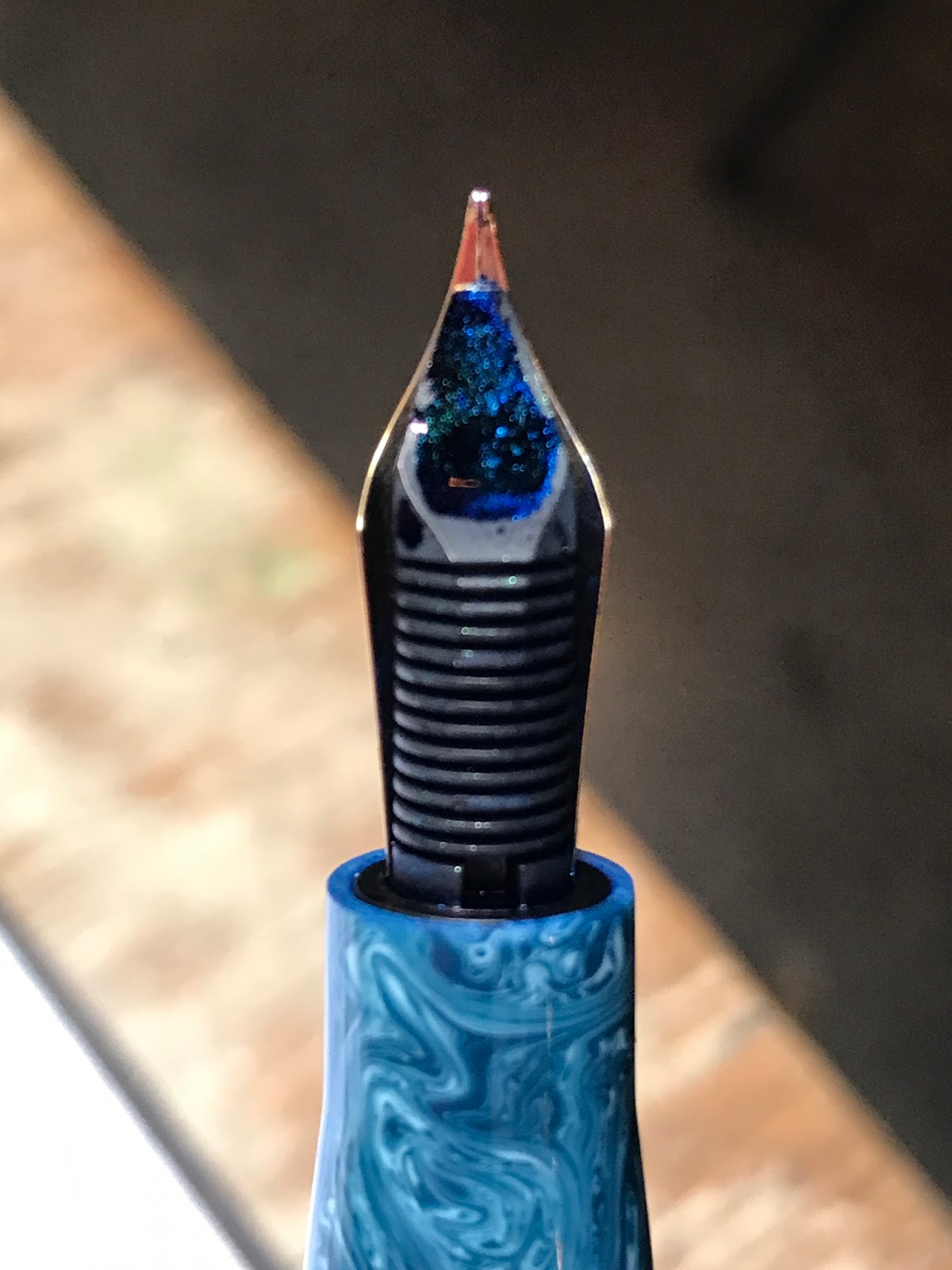
Cap off, the gold coloured steel nib looks good. I'm not sure about the step between section and barrel; the resin is a little lighter in a few spots than I'd like; but that's over-picky.
It's a seductive little sucker!
8/10
APPEARANCE
AND DESIGN
If it wasn't already clear, the Momento Zero has a lot of strada appeal (yes, that's Italian for 'Street').
Leonardo makes this pen in a few guises: celluloid, ebonite and resin. Each of the models are the same shape and dimensions; but the celluloid and ebonite have gold nibs, are piston fillers, have ebonite feeds, are produced in very limited numbers (100 of the celluloid and 10 of the ebonite) and cost over four times more than the Resin and Steel, captive converter, plastic feed alternatives.
It would be fair to say that my pen's celluloid sibling is the star of this Model; but its resin relation is no slouch!
It was the Momento Zero's looks that first drew me to the pen on-line, and regardless of the material, the design, quality, and looks do not disappoint.
Reminiscent of other Italian fountain pens, while not a particularly new or innovative design the Momento Zero still represents a nod to the better styles of OMAS, Delta and Montegrappa (in Montegrappa's less rococo phases). This is not entirely surprising given that Leonardo's founder, Salvatore Matron, worked for Delta and his Company has, amongst other things, put together pens for the OMAS inspired Armando Simoni Club (ASC).
From the moment you hold the Momento Zero and turn it in your hand, you can see the touches that suggest the Leonardo brand has a future. From the slightly pointed finial and culo (bottom), to the depth of the resin swirls; from the roller at the end of the gold clip to the twin gold bands at the bottom of the cap; it's the details that create the momento.
The Resin version of the Momento Zero is numbered but not limited (the celluloid and ebonite versions are limitied). It's an interesting choice, but it works for me (and maintains that slightly quirky, Italian variation on a theme).The cap doesn't post deeply; but it posts securely and, while adding length, doesn't overbalance the pen but provides the profile with even more surf and sky.
Two design aspects that I am not so keen on are the lack of an ink-window (always a helpful feature but missing here) and the step between the section and barrel. The step was designed I assume to give the Momento Zero a relatively consistent profile and flow when capped. When capped, the Momento Zero's profile is relatively straight. This is achieved by having a cut between the body and section that is marked with a gold band. While the section cut delivers flow on the capped pen, that flow is jarringly severed once uncapped. It's not a huge step, but enough that I could feel a disturbance in the (design) force.
| you can see the step here under the threads, marked by the gold band. It's not big, but it's noticeable. |
The section itself is a good size. The threads are soft and towards the rear of the section so should not interfere with most people's writing position.
8/10
WEIGHT
AND DIMENSIONS
It's light, but not too much so (25g). There would be no fatigue issues writing Dante's Inferno with the Momento Zero over a chianti or three.
Capped,
the Momento Zero measures 142mm.
Uncapped, that length reduces to around 129mm.
Posted
the Momento Zero extends to 169mm. The measurements should tell you that it's not a deep poster, but it's secure. The cap is also quite light, so posting doesn't pose a balance problem. For those who grip their pen on the section (which is the majoritiy of you - unlike me), posting may make the pen a little too long; but in that case the pen is a good size uncapped in any case (buy a Penwell and your cap problem will go away!).
Using a Lamy Safari and a Pelikan 805 as comparisons, the Momento Zero measures almost identically. Although I have a tendency to prefer a marginally heavier pen, this is an excellent size and weight in my view.
8/10
NIB
AND PERFORMANCE
The nib is a gold-coloured Leonardo branded #6 size steel nib. I have the Medium and it wrote smoothly immediately out of the box.
It's more al dente than flex, so not a lot of variation or bounce; but the nib glides along the paper like a gondola on a Venetian lagoon.
The nibs are one of the differentiators between the various Leonardo Momento Zero models. The resin version is steel with a plastic feed. The celluloid and ebonite versions are 14k gold and ebonite feeds that sound extremely promising. Nevertheless, for significantly less Lira, the performance of the steel nib is delightful.
It's more al dente than flex, so not a lot of variation or bounce; but the nib glides along the paper like a gondola on a Venetian lagoon.
| The plastic feed here, is a little excited by being glistened with some Colorverse Cat Ink |
The nibs are one of the differentiators between the various Leonardo Momento Zero models. The resin version is steel with a plastic feed. The celluloid and ebonite versions are 14k gold and ebonite feeds that sound extremely promising. Nevertheless, for significantly less Lira, the performance of the steel nib is delightful.
![]() |
| Top is normal writing, next is fast writing, bottom is reverse writing. No skips, all solid. |
8/10
FILLING
SYSTEM
You know by now that I'm a piston-filling sort of guy; and, of course, the celluloid and ebonite models of the Momento Zero are piston fillers.
The resin version of the Momento Zero is your next best option mixed with a little slight-of-hand in the form of a "captive converter". Sticking with the magic analogy, the captive converter provides the distraction to the audience, while the writer is in command of the real story.
What does this mean? Go to the bottom of the barrel and you unscrew the resin and reveal a brass (or gold coloured) turning knob. Put your nib in a bottle of ink, turn the knob, and for all intents and purposes, you have a piston filler in action - but you don't.
(Turn away now if you don't want to know how the trick works).
Unscrew the section and you'll see a long but otherwise fairly standard converter that goes down to the bottom of the barrel. Thus the Momento Zero resin model can be filled either with the section screwed on or off.
So it's not a piston-filler; but whichever way you choose to fill it with ink, it's easy to fill, the converter is a good size so there is a nice ink capacity, it's easy to clean, and the nib delivers that ink wonderfully to the page.
The resin version of the Momento Zero is your next best option mixed with a little slight-of-hand in the form of a "captive converter". Sticking with the magic analogy, the captive converter provides the distraction to the audience, while the writer is in command of the real story.
What does this mean? Go to the bottom of the barrel and you unscrew the resin and reveal a brass (or gold coloured) turning knob. Put your nib in a bottle of ink, turn the knob, and for all intents and purposes, you have a piston filler in action - but you don't.
| Ooo look, a Piston-filler.... |
Unscrew the section and you'll see a long but otherwise fairly standard converter that goes down to the bottom of the barrel. Thus the Momento Zero resin model can be filled either with the section screwed on or off.
| Here is the real story: everything unscrewed. |
8/10
COST
AND VALUE
I've made a number of references in this review to the different models of the Momento Zero and their different price points. The resin model retails for around 121 Euros; so it's not a cheap pen. For that money however, you get the look, feel and overall quality of a fountain pen that is great value for your lira.
The celluloid and ebonite versions retail at around 569 Euro (excluding VAT). I believe most are now sold out so there is no shortage of interest. Nevertheless, at that price, the celluloid and ebonite versions of the Momento Zero are up against some stiff competition, limited editions or not. As big a celluloid and ebonite lover as I am, sight unseen I wasn't prepared to take the risk to purchase the celluloid or ebonite versions. Having received the resin version, and written with it, I would have to say that I'm very impressed and suspect that the more expensive versions will also give other models a run for their money.
9/10
CONCLUSION
The Leonardo Officina Italliana Momento Zero is a piccolo touch of italian pennacchio! (the italian for style and flamboyance that, naturally, begins with a 'pen').
It looks great, performs well and is excellent value for money. I look forward to seeing the Leonardo Brand extending its offerings in the future and continuing to elicit more enigmatic smiles from its users.
82/100
00-50
|
To be avoided at all costs
|
51-60
|
It’s cheap and you don’t really care
|
61-70
|
A nice pen with the makings of something better (just don’t spend too much)
|
71-80
|
A better than average pen with just a few flaws that stop it from being really good.
|
81-90
|
A good pen, a keeper, only a few minor places off being great
|
91-95
|
Now THIS is a pen! If you can get it: keep it, love it, cherish it, and keep it away from the dog
|
96-100
|
GRAIL
|
Monday, 9 October 2017
This notebook is a Ripper! (and that was a tear-able joke!)
Bookbinders
Design** is one of my favourite Melbourne stationery haunts. Its owners love what
they do and you can feel the stationery love each time you meander through its well
organised, colour-coded collections of notebooks (including their own, Leuchturrm,
and Midori/Travellers) pens (including Caran d’Ache and Ajoto), washi tape,
rubber stamps, paper (including Tomoe River) and general stationery paraphernalia.
The good folk at Bookbinders Design recently reached out to
me to write a review of their notebook, and, delightfully, provided me with a
monogramed notebook for the review. While the focus of this blog is fountain
pens, clearly if one uses a fountain pen, one uses it on something: generally
paper. Unbiased by giveaways (but happy to accept them) today’s blog is therefore
a review of the Bookbinders Design Signature-design cloth notebook – clearly
with a focus on Fountain pens.
To assist me in this review, I engaged the talents of the many
who attended the recent Melbourne Pelikan Hubs event. “Please write in the notebook and
let me know what you think” I asked them; and write and divulge they did.
I also asked a fellow Fountain Pens Australia Facebook
member, (and one of the organisers of the Melbourne Pen Show) Silvana Abela, to
join me in putting this notebook to the test; so, fountain pens at the ready we
challenged and tested the Bookbinders Design Signature Notebook to see if it
performs as well as it looks.
| Our working table |
THE COVER
The cover is really the centerpiece of the Bookbinders
Design Signature Notebook. Indeed, as the name of the shop would imply, quality
bookbinding is the hallmark of this establishment. The colours especially are
what attracted me to both the shop and the notebook in the first place, and
provide a fabulous “ambiente” to the shop. Made in Sweden from what they call
“Bookbinding Linen” and coming in what I counted on their website to be over 20 different colours, these covers scream soft sophistication and sumptuous,
Scandinavian style.
| The colours in situ at Bookbinders by Design Shop |


The cornucopia of colours of Bookbinders Design Signature-design notebooks on their website
I’m not sure that my iPhone can really do
justice to the subtle weave of the cloth cover, but the weave is beautifully
delicate and just begs to be touched. That being said, the cloth doesn’t feel
flimsy or overly delicate either.
Bookbinders Design will also happily (for a price)
personalise your notebook with initials or text to give it that extra personal
touch. A range of fonts are offered including:
- Artcraft italic,
- Bodoni Trueface,
- Caslon Bold,
- Garamond Bold italic,
- Helvetica Medium and
- Mandate.
The lettering can be produced in seven different colours: gold,
silver, copper, blind (I guess you just can’t see that one), clear, black and
white (arguably, those latter too are not, technically, colours, but you get
the drift).
![]() | ||
Front cover
|
THE BINDING
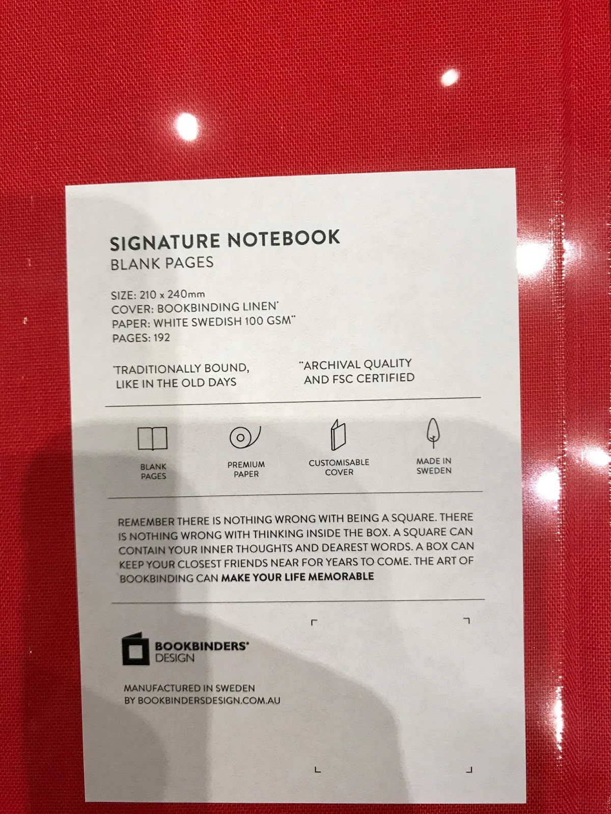
Coming in three sizes: 170mm x 200mm, 210 x 240mm and A4, Bookbinders
Design claim that their notebook in all its sizes is “Traditionally bound, like in the old days”. Unfortunately I cannot
claim to be a bookbinding buff; and I was not around in the old days (although
my daughter would beg to differ); nevertheless I can say that the binding is
certainly solid, it’s not stapled and I have no sense of anything other than
high quality. Hopefully
this picture will satisfy the more knowledgeable of you.
| Yes, it comes with a bookmark too |
The inside cover and opening page (front and back) are
covered with a colour-matching, slightly thicker grade card-stock followed (or
preceded in the case of the back cover) by the notebook proper. This both makes
the book look a cut above many others, and nicely reinforces the colours of the
cover.
The Bookbinders Design Signature Notebook does not open flat
but not too far from it. And in holding it open, there is no sense of it being
flimsy; or concern with it coming loose from its binding. Even so, one page or
the other will always pop up a little towards the centre of the notebook, and
this would be a little annoying if you were using it for drawing or similar
artistic endeavour.
PAPER
A notebook without paper is a folder. Paper maketh (or
unmaketh) the notebook. In this case, Bookbinders Design use white, Swedish
100gsm paper (I can’t tell you what the difference between Swedish and other
country’s 100gsm paper may be). The paper is smooth to the touch (so no obvious
fibres), and does not appear coated in any way (like Rhodia paper may be).
Bookbinders Design also make a number of additional claims
for the blank and ruled formats of their paper:
1.
Acid free
2.
Totally chlorine free (TCF) – I guess this means
you can swim in it without hurting your eyes
3.
Age-Resisting (what’s your secret?); and
4.
Forest Stewardship Certified (FSC).
What does all this mean? Well my research has dug up the
following:
1.
The advantage of Acid-free paper is that it
provides a good base for the things you put on your paper to remain there and
not disappear over time. Paper with acid in it (which is not uncommon) can
interact with the materials you use on the paper and cause them to decay over
time
2.
Chlorine is often used in the wood pulp
bleaching process. Why is this bad? Where chorine is used, the compounds are
generally released into waterways as effluent where they may produce
environmental damage. So this won’t change your writing experience, just something
for the soul (not to be underestimated).
3.
Age-resistant paper is also linked with the
acid-free component. According to an article sourced from Klug conservation, in
order for paper to claim that it is age-resistant it must meet the following
criteria:
“ • The paper must be free
of unbleached cellulose pulp or wooden fibres. Thus pulp or semi-pulp fibre
materials can be excluded.
• The paper must possess a
low content of oxidisable material,” …
“• The paper must have an
alkaline buffer – an alkaline reserve – of at least 2 % natural calcium
carbonate.
• The pH value in the cold
water extract must lie between 7.5 and 10.”
[See, that’s much clearer!]
4.
FSC is a certification that, since 1993 allows
customer to choose paper, amongst other things, that has been sourced in an
environmentally-friendly, socially responsible and economically viable way.
(source: mother nature network)
UNDER INK
OK. All this is starting well. The real test however, is how
does it cope with being written on?
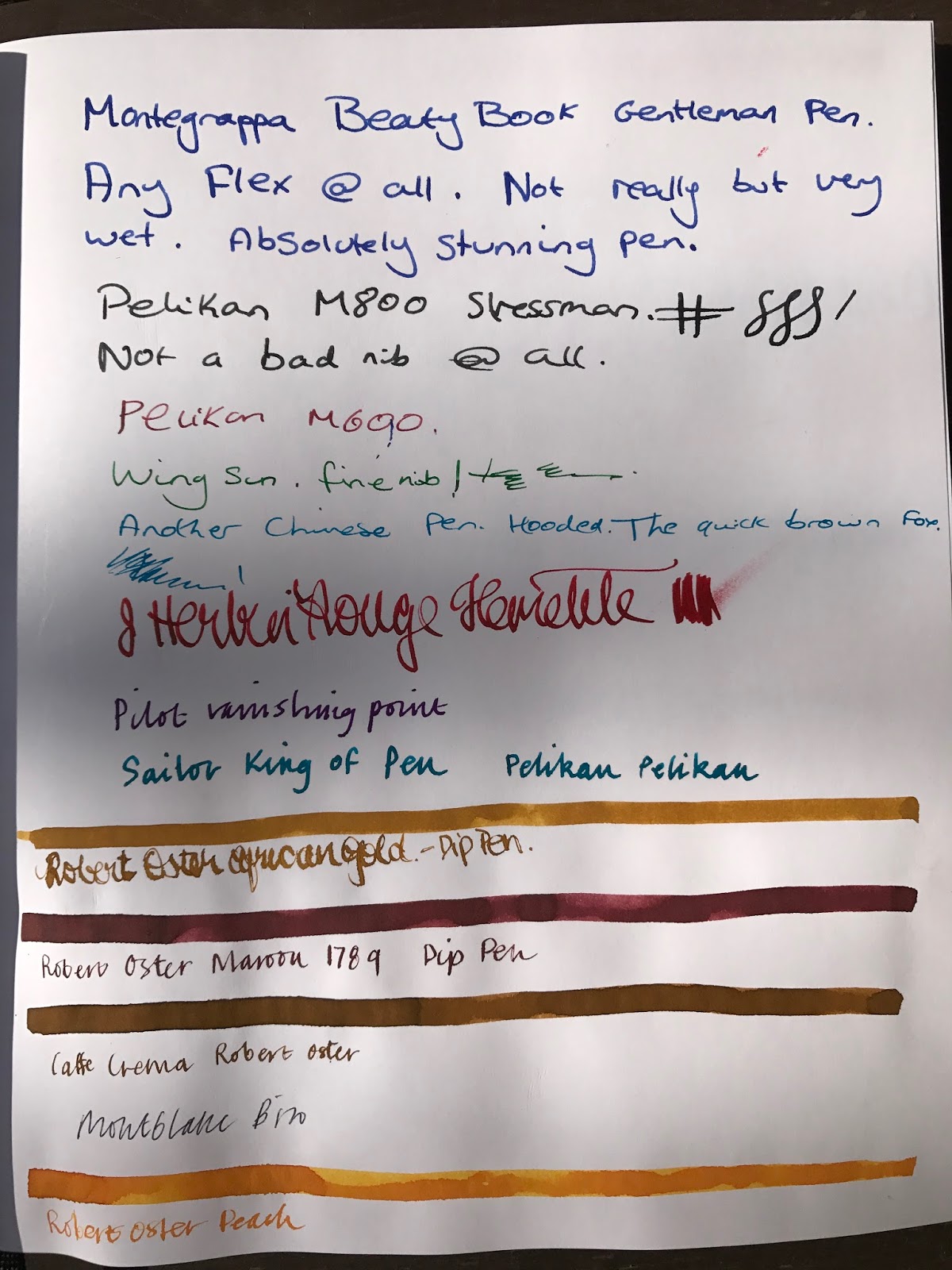
The Melbourne Pelikan Hubsters assisted this review by
writing in my Bookbinders Design Signature Notebook in various pens and inks.
Silvana and I then continued to play with the paper to see what it could do…
If you are planning to use a fountain pen, pencil, ballpoint or other writing implement to write in your Bookbinders notebook, we think you’ll be happy with your choice. We wrote on the paper
in a variety of inks and nibs and, with the exception of what looks like a red
marker (to the Pelkan Hubster that wrote “Pelikan Hubs” in red – feel free to
post a comment on what you used), there was really no bleed-through or problem.
![]() |
| Back of the previous page - very little bleed-through with fountain pens |
One hubster suggested that there was a little feathering;
but we examined the pages thoroughly and, other than with a 30x loupe, we could
not visibly discern any feathering with regular nibs. Drying time was about
average (probably quicker than Tomoe River). When we used dip nibs, however,
whether it was scratching the paper or a higher saturation of ink, there was some minor feathering to the writing.
Next we tried using some calligraphy pens of a brand named
Automatic Pens (that were a lot of fun to use, and easy to clean). The results here
were not so good. In each case we drew one continuous line and then wrote
underneath it, mostly in dip pen. What we found was that while there was no discernable
issue on the page in question, there was
bleed-through to the next page, and the dampness made an impression on a number
of following pages.
![]() |
| You can see the dip nibs start to feather a little here; although the saturated lines look OK. |
![]() |
| Unfortunately, those saturated lines have started to saturate through |
We were so intrigued by this that we wrote again on the
paper with a 2.4mm Pilot Parallel and a 1.1 Franklin Christoph stub nib (in a Pen Addict FC pen) to see if
there were any issues on the paper – there were none; but upon drawing another
wetter, thicker line underneath this, BAM, more bleed-through.
![]() |
| Once again, no real issue with normal fountain pen writing (even with the 2.4mm Pilot Parallel); but once the ink gets a little saturated... |
CONCLUSION
The Bookbinders Design Signature Notebook is an excellent,
value-for-money product. The quality of binding, the ridiculously large option
of different colour covers, the presentation and monogram options all make for
an extremely desirable and useful product/gift that will protect your writing and last for generations.
From a fountain pen (and ballpoint/pencil) users
perspective, the paper offers a fabulous surface for writing or drawing. If you
were thinking of using the notebook for painting or larger, wetter ink
exposures however, be wary of bleed-through to the next page – put something
behind the page to protect following pages and all should be forgiven.
Thankyou Bookbinders Design for providing the Notebook, and to Silvana and the Melbourne Pelikan Hub folk for their contributions to the testing regime. I look forward to seeing you all at the Melbourne Pen Show on 26 November; and don't forget to have a happy International Fountain Pen Day on 3 November.
Until next tine...
*Bookbinders Design should not be mistaken with that other
excellent Australian stationery purveyor: Bookbinders Online, which is an
unaffiliated stationery company based in Aspley, Queensland, on the North east
coast of Australia.
**Pelikan Hub is a world-wide event auspiced by Pelikan Pens
where fountain pen owners around the world are encouraged to meet in cities
around the world on a single night in September each year to share their pens,
inks and good humour.
Subscribe to:
Posts (Atom)