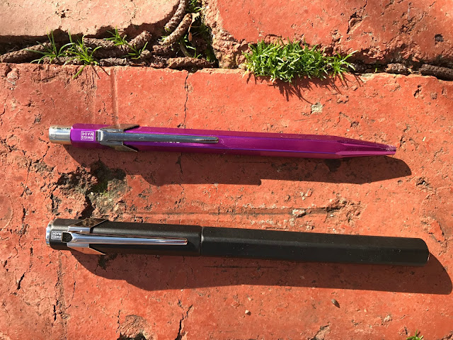
Caran
d’Ache (note: small ‘d’ big ‘A’).
Increasingly this brand seems to be making an appearance in the admiration
columns of stationary appreciation aficionados. Their pencils (looove
the Swiss Wood 348), their pencil sharpener (OMG!) their ball point 849s that
have been ridiculously popular and colourful, and now, at last, the 849
Fountain pen.
I first
saw an orange 849 Fountainpen previewed by Goldspot pens (no affiliation). Hmmm, I thought to myself. Love that colour,
sooo bright; but I’m not sure.
Then
Pen Chalet (still no affiliation) had a pre-order deal for US$52; and my next challenge was only to
decide the colour.
I ummed
and ahhed on the colour. I couldn’t see one in person so the website pics were
all I had to work with. I like the orange and green; but I wasn't sure how it
would go with a black section; so what about the white or black? I decided to go
for the simplicity of the one colour unit and, black decided, the order was
placed.
Box
open (Box is nothing too extraordinary, but functional).
It IS
thin.
It’s
long too.
But I like that look; a sort of industrial meets traditional. Yep, looks
fine so far.
7/10
APPEARANCE
AND DESIGN
If you
like the 849 ball point, you will like the look of its fountain pen bigger
cousin.
It’s
the same design – just a little wider and a little longer.
Firstly,
there’s the finial.
I really
like the look of this Caran d’Ache laser-etched hexagon. Simple and yet
striking. And it appears again on the nib:
 |
| I like how the ink has nicely emerged to reinforce the brand hexagon. |
The
clip is the same design again as the ballpoint 849, and the same length but wider. The
clip is nice and sturdy, looks very modern in that “industrial” sort of
way (which I like) and that works well with the overall look of the pen and its
Hexagonal shape (no rolling off the desk!).
The brand and model are discretely placed beneath the clip (same as the ballpoint) which is another nice design feature. I’m especially pleased that they include the model number as so few pen companies seem inclined to let you know which model of their pen you are using (pet peeve).
The brand and model are discretely placed beneath the clip (same as the ballpoint) which is another nice design feature. I’m especially pleased that they include the model number as so few pen companies seem inclined to let you know which model of their pen you are using (pet peeve).
The cap
clips securely to the pen, allowing the six sides to nicely align (it can spin around; but only if you’re
fiddling with it – and what’s wrong with a little fidgeting?) Closed there is a
lovely artistic balance from the silver finial on the top, to the slightly
protruding silver piece at the end of the barrel (is that called a finial too?).
I am a
poster (haha, yes the ‘t’ is meant to be there!); and this pen attempts to
smile kindly on posters. Remove the cap and you’ll notice that there is a small
reduction in circumference at its end that is silver rather than the main
colour of the pen (in my case black). That silver section is designed very
nicely to meet with the little silver end piece (finial?) so that the cap posts
securely and (although very long) neatly hides the silver and gives the posted
pen a long, slim and continuous silhouette. Clever. More on this later.
I
haven’t yet mentioned the section. If you are like most Quillophyles and hold
your fountain pen at the section (near the nib) then you will notice quite a
drop in circumference between the body and the section. On my very rough
calculation, the circumference of the 849’s body is around 1cm. The circumference
of the section is only about 6mm. That’s quite small. As it happens, I hold my
pens quite high, so I have no issue with the section. If you have larger hands
however, and hold your pens closer to the nib, you are likely to find this
quite small.
While
we’re on the section, as I mentioned, I bought this pen in black because I
noticed the section on all pens is black while the bodies are white, black, blue, pink, orange, yellow and green.
 |
| Photo borrowed from Pen Chalet web site (hope that's OK) |
The pen’s body is metal. It looks and
feels good. The pen’s section is plastic. The plastic is glossier than the
metal (not ridiculously so; but you notice it); and it feels lighter and, well, plastic. If you buy a pen in a colour
other than the black, then the section stands out in contrast. You may like
this, you may not; my internal jury is still out on this one. In the black, it's a non-issue. Additionally, the threads inside the barrel of the pen are
metal while the threads on the section are plastic. Over time, this may mean
that the metal wears down the plastic threads and you’ll need to get another
cap (or pen – they’re not ridiculously expensive).
7/10
WEIGHT
AND DIMENSIONS
Due to
the metal in the 849, there is a nice weight to this slender pen making it feel
about the same weight as a Lamy Safari. Comfortable.
Capped,
the 849 measures almost the same size as a Lamy Safari too, around 14cm.
Uncapped, that length reduces to around 12.3cm
(a Lamy Safari uncapped is about 13cm).
Posted
the 849 extends to a massive 17.7cm (a Safari would be around 17cm but it's a
much wider pen so more in proportion).
Posted, the cap is secure but has a little wobble/spin factor which is annoying and distracting. In any case, when the pen is that long it does tend to be unbalanced and make it less enjoyable to write with so I would recommend that it be written with unposted.
Posted, the cap is secure but has a little wobble/spin factor which is annoying and distracting. In any case, when the pen is that long it does tend to be unbalanced and make it less enjoyable to write with so I would recommend that it be written with unposted.
6.5/10
NIB
AND PERFORMANCE
The nib (steel) on the 849 is a little unusual. In
width it’s about a number 5; but, just as it’s body is lithe, so too is its nib
tall and skinny.
That
said, the nib size and look complements the whole pen perfectly.
Now
let’s talk about writing.
I
bought a Medium, put pen to paper and what a gusher! It writes beautifully,
smoothly and very, very wet.

The comparison I have done here, shows that this medium is broader than both my Sailor medium (perhaps to be expected) and my OMAS medium (less expected). In either case, I am not unhappy about this. The Caran d’Ache 849 is a very nice writer. Although it is more balanced unposted, if you choose to write that way and trust yourself not to lose the cap, this is a lovely writing pen.

The comparison I have done here, shows that this medium is broader than both my Sailor medium (perhaps to be expected) and my OMAS medium (less expected). In either case, I am not unhappy about this. The Caran d’Ache 849 is a very nice writer. Although it is more balanced unposted, if you choose to write that way and trust yourself not to lose the cap, this is a lovely writing pen.
7/10
FILLING
SYSTEM
The 849
does not come with a converter, but will take one. Mine came with a cartridge,
although I chose to use another I already had. The body is long enough to take most cartridges; but with metal threads in the body could not be an eyedropper.
I always prefer piston fillers; nevertheless this is efficient enough and does the job admirably.
I always prefer piston fillers; nevertheless this is efficient enough and does the job admirably.
8/10
COST
AND VALUE
There
are cheaper, Chinese and Taiwanese pens around. There are more expensive
Japanese and European pens around. If you can cope with the narrow stature of
this pen however, the Caran d’Ache really is a good deal. The design is clever
and cool. The colours are awesome and individual. The steel nib is a pleasant
surprise; and the overall package is very satisfying and quite affordable.
7/10
CONCLUSION
Caran
d’Ache have done a fabulous job converting their very popular ballpoint pen to
a real one (come on, challenge me!!) This is a pen I am enjoying writing with,
that looks clever and different and “now”, that performs well, feels solid and
is available in an attainable price range. Now, if Caran d’Ache made this pen
about 5mm wider… now there would be
a pen!
71/100
00-50
|
To be avoided at all costs
|
51-60
|
It’s cheap and you don’t really care
|
61-70
|
A nice pen with the makings of something better (just don’t spend too much)
|
71-80
|
A better than average pen with just a few flaws that stop it from being really good.
|
| 81-90 | A good pen, a keeper, only a few minor places off being great |
91-95
|
Now THIS is a pen! If you can get it: keep it, love it, cherish it, and keep it away from the dog
|
96-100
|
GRAIL
|


