Monday, 9 October 2017

This notebook is a Ripper! (and that was a tear-able joke!)


In the hustle and bustle of Little Collins Street in the Melbourne CBD, lies a humble, little stationery haven named Bookbinders Design*. 

Bookbinders Design** is one of my favourite Melbourne stationery haunts. Its owners love what they do and you can feel the stationery love each time you meander through its well organised, colour-coded collections of notebooks (including their own, Leuchturrm, and Midori/Travellers) pens (including Caran d’Ache and Ajoto), washi tape, rubber stamps, paper (including Tomoe River) and general stationery paraphernalia.

The good folk at Bookbinders Design recently reached out to me to write a review of their notebook, and, delightfully, provided me with a monogramed notebook for the review. While the focus of this blog is fountain pens, clearly if one uses a fountain pen, one uses it on something: generally paper. Unbiased by giveaways (but happy to accept them) today’s blog is therefore a review of the Bookbinders Design Signature-design cloth notebook – clearly with a focus on Fountain pens.

To assist me in this review, I engaged the talents of the many who attended the recent Melbourne Pelikan Hubs event. “Please write in the notebook and let me know what you think” I asked them; and write and divulge they did.

I also asked a fellow Fountain Pens Australia Facebook member, (and one of the organisers of the Melbourne Pen Show) Silvana Abela, to join me in putting this notebook to the test; so, fountain pens at the ready we challenged and tested the Bookbinders Design Signature Notebook to see if it performs as well as it looks.
Our working table

THE COVER
The cover is really the centerpiece of the Bookbinders Design Signature Notebook. Indeed, as the name of the shop would imply, quality bookbinding is the hallmark of this establishment. The colours especially are what attracted me to both the shop and the notebook in the first place, and provide a fabulous “ambiente” to the shop. Made in Sweden from what they call “Bookbinding Linen” and coming in what I counted on their website to be over 20 different colours, these covers scream soft sophistication and sumptuous, Scandinavian style.
The colours in situ at Bookbinders by Design Shop

Notebook Cloth 210 x 240 mm
 
Notebook Cloth 210 x 240 mm
 
Notebook Cloth 210 x 240 mm
 
Notebook Cloth 210 x 240 mm
 
Notebook Cloth 210 x 240 mm
 
Notebook Cloth 210 x 240 mm
 
Notebook Cloth 210 x 240 mm
 
Notebook Cloth 210 x 240 mm
 
Notebook Cloth 210 x 240 mm
 
Notebook Cloth 210 x 240 mm
 
Notebook Cloth 210 x 240 mm
 
Notebook Cloth 210 x 240 mm
 
Notebook Cloth 210 x 240 mm
 
Notebook Cloth 210 x 240 mm
 
Notebook Cloth 210 x 240 mm
 
Notebook Cloth 210 x 240 mm
 
Notebook Cloth 210 x 240 mm
 
Notebook Cloth 210 x 240 mm


The cornucopia of colours of Bookbinders Design Signature-design notebooks on their website

I’m not sure that my iPhone can really do justice to the subtle weave of the cloth cover, but the weave is beautifully delicate and just begs to be touched. That being said, the cloth doesn’t feel flimsy or overly delicate either.

Bookbinders Design will also happily (for a price) personalise your notebook with initials or text to give it that extra personal touch. A range of fonts are offered including:
  • Artcraft italic,
  • Bodoni Trueface,
  • Caslon Bold,
  • Garamond Bold italic,
  • Helvetica Medium and
  • Mandate.


The lettering can be produced in seven different colours: gold, silver, copper, blind (I guess you just can’t see that one), clear, black and white (arguably, those latter too are not, technically, colours, but you get the drift).

Front cover
Back cover - subtle logo
THE BINDING
Coming in three sizes: 170mm x 200mm, 210 x 240mm and A4, Bookbinders Design claim that their notebook in all its sizes is “Traditionally bound, like in the old days”Unfortunately I cannot claim to be a bookbinding buff; and I was not around in the old days (although my daughter would beg to differ); nevertheless I can say that the binding is certainly solid, it’s not stapled and I have no sense of anything other than high quality. Hopefully this picture will satisfy the more knowledgeable of you.
Yes, it comes with a bookmark too

The inside cover and opening page (front and back) are covered with a colour-matching, slightly thicker grade card-stock followed (or preceded in the case of the back cover) by the notebook proper. This both makes the book look a cut above many others, and nicely reinforces the colours of the cover.

 
The Bookbinders Design Signature Notebook does not open flat but not too far from it. And in holding it open, there is no sense of it being flimsy; or concern with it coming loose from its binding. Even so, one page or the other will always pop up a little towards the centre of the notebook, and this would be a little annoying if you were using it for drawing or similar artistic endeavour.
 
PAPER
A notebook without paper is a folder. Paper maketh (or unmaketh) the notebook. In this case, Bookbinders Design use white, Swedish 100gsm paper (I can’t tell you what the difference between Swedish and other country’s 100gsm paper may be). The paper is smooth to the touch (so no obvious fibres), and does not appear coated in any way (like Rhodia paper may be).
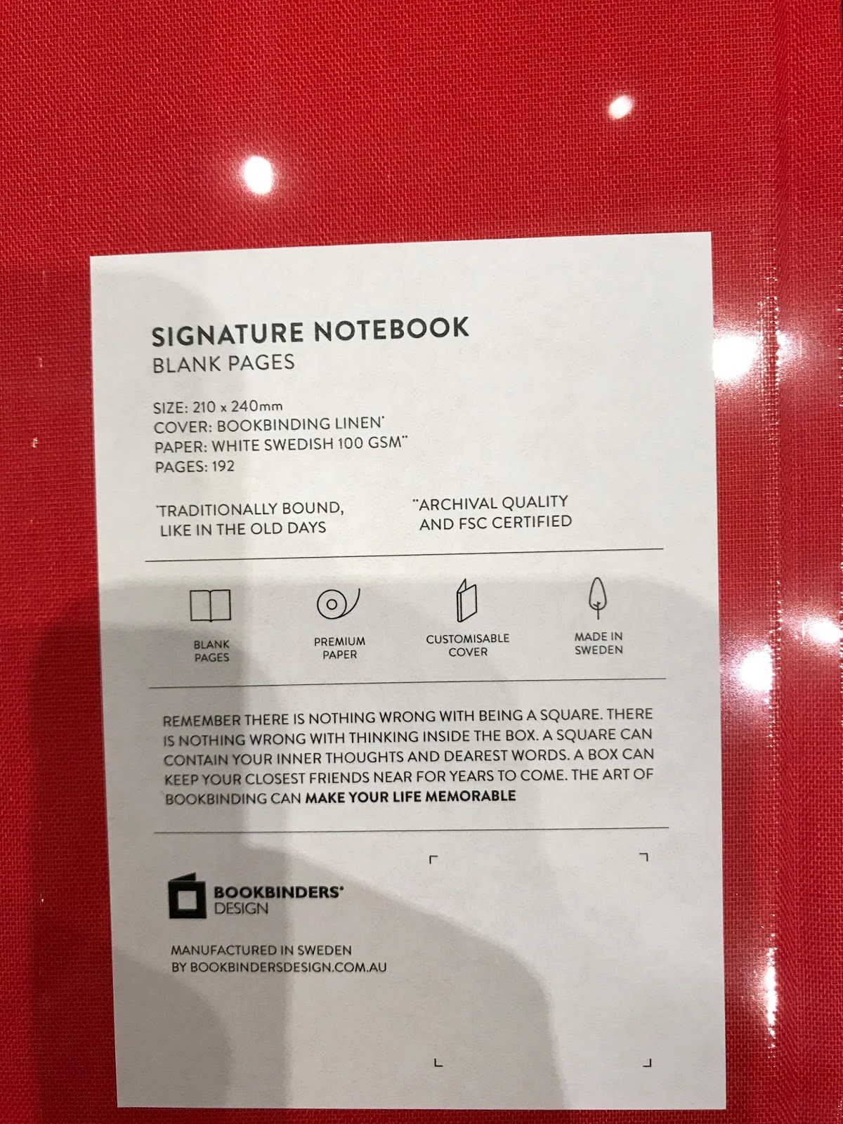
Bookbinders Design also make a number of additional claims for the blank and ruled formats of their paper:

1.    Acid free
2.    Totally chlorine free (TCF) – I guess this means you         can swim in it without hurting your eyes
3.    Age-Resisting (what’s your secret?); and
4.    Forest Stewardship Certified (FSC).

What does all this mean? Well my research has dug up the following:

1.    The advantage of Acid-free paper is that it provides a good base for the things you put on your paper to remain there and not disappear over time. Paper with acid in it (which is not uncommon) can interact with the materials you use on the paper and cause them to decay over time
2.    Chlorine is often used in the wood pulp bleaching process. Why is this bad? Where chorine is used, the compounds are generally released into waterways as effluent where they may produce environmental damage. So this won’t change your writing experience, just something for the soul (not to be underestimated).
3.    Age-resistant paper is also linked with the acid-free component. According to an article sourced from Klug conservation, in order for paper to claim that it is age-resistant it must meet the following criteria:
“ • The paper must be free of unbleached cellulose pulp or wooden fibres. Thus pulp or semi-pulp fibre materials can be excluded.
• The paper must possess a low content of oxidisable material,” …
“• The paper must have an alkaline buffer – an alkaline reserve – of at least 2 % natural calcium carbonate.
• The pH value in the cold water extract must lie between 7.5 and 10.”
[See, that’s much clearer!]
4.    FSC is a certification that, since 1993 allows customer to choose paper, amongst other things, that has been sourced in an environmentally-friendly, socially responsible and economically viable way. (source: mother nature network)

UNDER INK
OK. All this is starting well. The real test however, is how does it cope with being written on?

The Melbourne Pelikan Hubsters assisted this review by writing in my Bookbinders Design Signature Notebook in various pens and inks. Silvana and I then continued to play with the paper to see what it could do…

If you are planning to use a fountain pen, pencil, ballpoint or other writing implement to write in your Bookbinders notebook, we think you’ll be happy with your choice. We wrote on the paper in a variety of inks and nibs and, with the exception of what looks like a red marker (to the Pelkan Hubster that wrote “Pelikan Hubs” in red – feel free to post a comment on what you used), there was really no bleed-through or problem.

Back of the previous page - very little bleed-through with fountain pens


One hubster suggested that there was a little feathering; but we examined the pages thoroughly and, other than with a 30x loupe, we could not visibly discern any feathering with regular nibs. Drying time was about average (probably quicker than Tomoe River). When we used dip nibs, however, whether it was scratching the paper or a higher saturation of ink, there was some minor feathering to the writing.

Next we tried using some calligraphy pens of a brand named Automatic Pens (that were a lot of fun to use, and easy to clean). The results here were not so good. In each case we drew one continuous line and then wrote underneath it, mostly in dip pen. What we found was that while there was no discernable issue on the page in question, there was bleed-through to the next page, and the dampness made an impression on a number of following pages. 
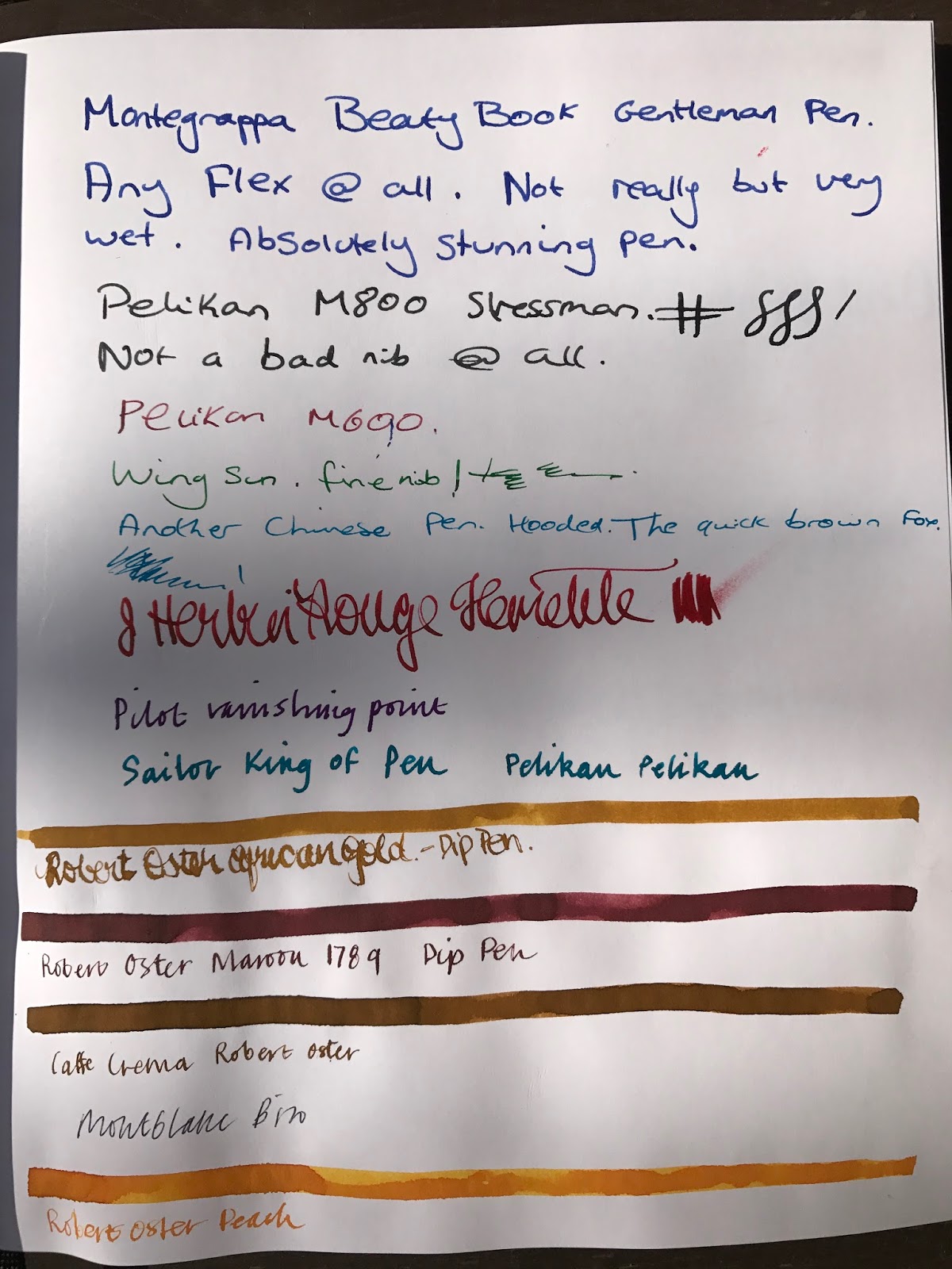
You can see the dip nibs start to feather a little here; although the saturated lines look OK.
Unfortunately, those saturated lines have started to saturate through

We were so intrigued by this that we wrote again on the paper with a 2.4mm Pilot Parallel and a 1.1 Franklin Christoph stub nib (in a Pen Addict FC pen) to see if there were any issues on the paper – there were none; but upon drawing another wetter, thicker line underneath this, BAM, more bleed-through.


Once again, no real issue with normal fountain pen writing (even with the 2.4mm Pilot Parallel); but once the ink gets a little saturated...
 We then tested the wider line and same ink on Rhodia graph paper  (which is coated) and Midori (MD) Paper (which does not appear to be coated) to see if they performed any better. The Midori paper had no bleed through at all and the Rhodia paper had next to no bleed-through. Our conclusion is that perhaps all that environmentally positive lack of bleaching, chlorine and the FSC accreditation means that some of the chemicals needed to stop the bleed-through were unable to be used here, causing some issue when a more saturated ink line is required.

Just to be thorough, we tried a few ballpoint and pencil scribblings too (we drew the line - see what I did there? - at rollerballs); and unsurprisingly all was good on that front.


CONCLUSION
The Bookbinders Design Signature Notebook is an excellent, value-for-money product. The quality of binding, the ridiculously large option of different colour covers, the presentation and monogram options all make for an extremely desirable and useful product/gift that will protect your writing and last for generations.

From a fountain pen (and ballpoint/pencil) users perspective, the paper offers a fabulous surface for writing or drawing. If you were thinking of using the notebook for painting or larger, wetter ink exposures however, be wary of bleed-through to the next page – put something behind the page to protect following pages and all should be forgiven.

Thankyou Bookbinders Design for providing the Notebook, and to Silvana and the Melbourne Pelikan Hub folk for their contributions to the testing regime. I look forward to seeing you all at the Melbourne Pen Show on 26 November; and don't forget to have a happy International Fountain Pen Day on 3 November.

 Until next tine...


*Bookbinders Design should not be mistaken with that other excellent Australian stationery purveyor: Bookbinders Online, which is an unaffiliated stationery company based in Aspley, Queensland, on the North east coast of Australia.

**Pelikan Hub is a world-wide event auspiced by Pelikan Pens where fountain pen owners around the world are encouraged to meet in cities around the world on a single night in September each year to share their pens, inks and good humour.

Thursday, 21 September 2017

Wing Sung, Jinhao, Hero, Delike, Ling Mo and more are making Marx - but is it a Chinese Revolution?

I don't know about you, but I've been doing a little more than Peking into the recent batch of fountainpens coming out of China and, by and large there is Mao to like than I would have figured!

The Great Wall. From left: Wing Sung 618 (first 3 pens, mix between Parker 51 with Sailor Progear colouring), Jinhao 992 (green, Sailor progear clone), Delike New Moon (another Sailor clone, slim, and solid colour), Wing Sung 698 (Twsbi variation), 5 more Jinhao 992s in different colours, and a Ling Mo Lorelei (yes, the spirit that lured Sailors to their death!)
I know that imitation is meant to be the most sincere form of flattery but surely there has to come a point....! 

Yes, they're derivative; very derivative. These Chinese fountainpen offspring are clearly not the first borns of the Lamy, Parker, Montblanc, Sailor and even Twsbi that they seek to emulate;  nevertheless, they are generally inexpensive (I paid AU$1.25 for a Lamy Safari cloned Hero 359 in transparent green); and some offer interesting variations on the theme.

Wing Sung is one brand that appears to be playing with its designs and doing a good job with it. [For an incisive review of the Wing Sung brand evolution, go here: the new Wing Sung ]

I have recently acquired two Wing Sung models: the much lauded 698 and the 618 (also called TuSu). The 698 is essentially a (cheaper) copy of the TWSBI 580; and the 618 is the love-child of the Parker 51 (hooded nib, arrowed clip) and the Sailor sparklies. While the derivative theme remains however, the differences are interesting. 

Wing Sung 698, inked with Caran d'Ache Amazon
The Wing Sung 698 has a clever locking mechanism on the piston to stop accidental turns and inkplosions (especially when posted). Twsbi doesn't have this. The nib has a clear feed (which is nice), is more than adequate in its own right and is interchangeable with Pilot Kakuno and Metropolitan - making it quite versatile. The ink capacity, like the Twsbi, is significant, making it an excellent long-writing-stint pen and only AU$15. Do I prefer it to my TWSBI 580? No. As good as it is, the TWSBI feels more solid and has an intangible higher feel of quality to it (Which it should given that I could buy six 698s for the price of one TWSBI - which in itself is not expensive) . I'm not passing in my TWSBIs; but I am very happy with my 698, and it will remain in my rotation as a serious contender for my attention.
Wing Sung TuSu 618
The WIng Sung TuSu 618 is their latest offering. Another piston filling pen but this time with a hooded nib and gold arrow clip (a la Parker 51) with steel and 12k gold nibs (I only have the steel) and sporting a semi-transparent coloured body with little touches of glitter akin to Sailor offerings. There is also a non-glitter navy blue edition. These pens are attractive; but to my eyes appear a little gaudy and plasticky. They are also very, very light, which adds to the sense of "cheapness" to the pens. This said, the writing experience is excellent and the price low (same as the 698, but to me not up to the same standard). The factor that sets these pens aside as part of a serious and improving Chinese pen offering, is that Wing Sung are experimenting with differences that are drawing attention to their brand in its own right and gathering a following.


Pens like the Ling Mo Lorelei and Delike New Moon (pictured below) are also upping the feel of quality in Chinese pens and adding to the "legitimacy" of Chinese pen offerings against their more costly rivals and making Chinesse pens a genuine alternative to the "main-stream" international brands.

Chinese pens have always been cheaper, but now they are starting to rival for substance. It will take a long march indeed for these Chinese siblings to match the originals; so it's not so much a revolution as an evolution - and anything may happen along the way. 

Nevertheless, if the current progress of Chinese pens continues, the entire Quillosphere will benefit from the results.


PS. Don't forget that November 3rd is the date for the 2017 Fountain Pen Day

Go here for more information and support Quillidealism everywhere!


Sunday, 9 July 2017

A d'Ache above the rest (the 849 Fountain Pen)

Caran d’Ache (note: small ‘d’ big ‘A’).

Increasingly this brand seems to be making an appearance in the admiration columns of stationary appreciation aficionados. Their pencils (looove the Swiss Wood 348), their pencil sharpener (OMG!) their ball point 849s that have been ridiculously popular and colourful, and now, at last, the 849 Fountain pen.

I first saw an orange 849 Fountainpen previewed by Goldspot pens (no affiliation).  Hmmm, I thought to myself. Love that colour, sooo bright; but I’m not sure.

Then Pen Chalet (still no affiliation) had a pre-order deal for US$52; and my next challenge was only to decide the colour.

I ummed and ahhed on the colour. I couldn’t see one in person so the website pics were all I had to work with. I like the orange and green; but I wasn't sure how it would go with a black section; so what about the white or black? I decided to go for the simplicity of the one colour unit and, black decided, the order was placed.


FIRST IMPRESSIONS!


Box open (Box is nothing too extraordinary, but functional).

It IS thin.

It’s long too.

But I like that look; a sort of industrial meets traditional. Yep, looks fine so far.

7/10

APPEARANCE AND DESIGN
If you like the 849 ball point, you will like the look of its fountain pen bigger cousin.

It’s the same design – just a little wider and a little longer.

It’s still slender for a fountain pen; and I’m not yet sure how it will go for long sessions; however, it has some nice features and remains an attractive writing vehicle.

Firstly, there’s the finial.


I really like the look of this Caran d’Ache laser-etched hexagon. Simple and yet striking. And it appears again on the nib:

I like how the ink has nicely emerged to reinforce the brand hexagon.
The clip is the same design again as the ballpoint 849, and the same length but wider. The clip is nice and sturdy, looks very modern in that “industrial” sort of way (which I like) and that works well with the overall look of the pen and its Hexagonal shape (no rolling off the desk!). 

The brand and model are discretely placed beneath the clip (same as the ballpoint) which is another nice design feature. I’m especially pleased that they include the model number as so few pen companies seem inclined to let you know which model of their pen you are using (pet peeve).

The cap clips securely to the pen, allowing the six sides to nicely align (it can spin around; but only if you’re fiddling with it – and what’s wrong with a little fidgeting?) Closed there is a lovely artistic balance from the silver finial on the top, to the slightly protruding silver piece at the end of the barrel (is that called a finial too?).
I am a poster (haha, yes the ‘t’ is meant to be there!); and this pen attempts to smile kindly on posters. Remove the cap and you’ll notice that there is a small reduction in circumference at its end that is silver rather than the main colour of the pen (in my case black). That silver section is designed very nicely to meet with the little silver end piece (finial?) so that the cap posts securely and (although very long) neatly hides the silver and gives the posted pen a long, slim and continuous silhouette. Clever. More on this later.

I haven’t yet mentioned the section. If you are like most Quillophyles and hold your fountain pen at the section (near the nib) then you will notice quite a drop in circumference between the body and the section. On my very rough calculation, the circumference of the 849’s body is around 1cm. The circumference of the section is only about 6mm. That’s quite small. As it happens, I hold my pens quite high, so I have no issue with the section. If you have larger hands however, and hold your pens closer to the nib, you are likely to find this quite small.

While we’re on the section, as I mentioned, I bought this pen in black because I noticed the section on all pens is black while the bodies are white, black, blue, pink, orange, yellow and green. 

Photo borrowed from Pen Chalet web site (hope that's OK)
The pen’s body is metal. It looks and feels good. The pen’s section is plastic. The plastic is glossier than the metal (not ridiculously so; but you notice it); and it feels lighter and, well, plastic. If you buy a pen in a colour other than the black, then the section stands out in contrast. You may like this, you may not; my internal jury is still out on this one. In the black, it's a non-issue. Additionally, the threads inside the barrel of the pen are metal while the threads on the section are plastic. Over time, this may mean that the metal wears down the plastic threads and you’ll need to get another cap (or pen – they’re not ridiculously expensive).
7/10

WEIGHT AND DIMENSIONS
Due to the metal in the 849, there is a nice weight to this slender pen making it feel about the same weight as a Lamy Safari. Comfortable.

Capped, the 849 measures almost the same size as a Lamy Safari too, around 14cm. Uncapped, that length reduces to around 12.3cm  (a Lamy Safari uncapped is about 13cm).
Posted the 849 extends to a massive 17.7cm (a Safari would be around 17cm but it's a much wider pen so more in proportion). 

Posted, the cap is secure but has a little wobble/spin factor which is annoying and distracting. In any case, when the pen is that long it does tend to be unbalanced and make it less enjoyable to write with so I would recommend that it be written with unposted.
6.5/10

NIB AND PERFORMANCE
The nib (steel) on the 849 is a little unusual. In width it’s about a number 5; but, just as it’s body is lithe, so too is its nib tall and skinny.

That said, the nib size and look complements the whole pen perfectly.
Now let’s talk about writing.

I bought a Medium, put pen to paper and what a gusher! It writes beautifully, smoothly and very, very wet. 

The comparison I have done here, shows that this medium is broader than both my Sailor medium (perhaps to be expected) and my OMAS medium (less expected). In either case, I am not unhappy about this. The Caran d’Ache 849 is a very nice writer. Although it is more balanced unposted, if you choose to write that way and trust yourself not to lose the cap, this is a lovely writing pen.
7/10

FILLING SYSTEM
The 849 does not come with a converter, but will take one. Mine came with a cartridge, although I chose to use another I already had. The body is long enough to take most cartridges; but with metal threads in the body could not be an eyedropper.

I always prefer piston fillers; nevertheless this is efficient enough and does the job admirably.
8/10

COST AND VALUE
There are cheaper, Chinese and Taiwanese pens around. There are more expensive Japanese and European pens around. If you can cope with the narrow stature of this pen however, the Caran d’Ache really is a good deal. The design is clever and cool. The colours are awesome and individual. The steel nib is a pleasant surprise; and the overall package is very satisfying and quite affordable.
7/10

CONCLUSION
Caran d’Ache have done a fabulous job converting their very popular ballpoint pen to a real one (come on, challenge me!!) This is a pen I am enjoying writing with, that looks clever and different and “now”, that performs well, feels solid and is available in an attainable price range. Now, if Caran d’Ache made this pen about 5mm wider… now there would be a pen!
71/100


00-50
To be avoided at all costs
51-60
It’s cheap and you don’t really care
61-70
A nice pen with the makings of something better (just don’t spend too much)
71-80
A better than average pen with just a few flaws that stop it from being really good.
81-90A good pen, a keeper, only a few minor places off being great
91-95
Now THIS is a pen! If you can get it: keep it, love it, cherish it, and keep it away from the dog
96-100
GRAIL


Tuesday, 4 July 2017

In praise of Robert Oster inks - Koala-ty in a bottle!

I don't really write ink reviews. So if you're looking for water tests, chromatic paper variations, wetness tests, viscosity et al; do not look here.

I do however, like USING inks; lots of them (although I maintain I'm not a collector, just an accumulator). 

For me, it's the colours, the shading and the sheen (OK, and occasionally the glitter) that draws me to an ink (pun intended). It is these factors that have lead Robert Oster Signature inks into my fountain pens and up to the top of my list of preferred ink manufacturers.


The label on at least one of my Robert Oster inks reads:
and enjoy we do! Firstly here in Australia, but now all over the world, all over social media, I read consistent and fervent desire and for and love of Oster inks colours, shades, sheens and variety.

It seems not so long ago, Robert Oster was chatting to a group of us on the Fountain Pens Australia (FPA) Facebook page about a few inks he had created. At that time I bought my first (and still favourite) Oster ink - Bondi Blue, and a few others (Australian Sky and Turquoise) that he sent in his fabulous gold foil, glitter paper together with a bonus Jinhao fountain pen. 
Now, there are something like 81 or more shades of Robert Oster Signature inks gracing the shelves and pens of quilliphyles across the globe! That's 81+ opportunities to excite! 

I said before that I was not an ink collector; and just to prove a point I have only 14 examples of this cornucopia of colour (although I DO wonder, just how many shades of blue do you really need?). Do I want more? Of course! But what is it that makes these inks so special? Well for me there are four things:

1. The variety. 81 plus colours. If you can't find a colour you      love here, you just don't like colour! 

2. Sheening. I just love sheening! What is sheening? It's the      appearance of a second colour in areas where the ink            pools up. Here is an example:


Not every Oster Ink sheens; but the ones that do are legendary! Bondi Blue, Fire and Ice, Peppermint, River of Fire are all examples of inks that ooze personality and surprise.

3. Robert Oster. Robert is not faceless manufacturer. He is      an active member of the fountain pen community.

Robert was contributing to conversations from almost the beginning of FPA. He provided free ink samples to the Melbourne Pen Show, he creates inks in response to questions and suggestions from individual users (the NG Special '16 and the FPA Kada Kada colours are great examples of this); and he remains active on major social media platforms and fountain pen hangouts (instagram, Facebook, etc) where he shows his inks, thanks people for their comments (whether positive or negative) and shares his views.

4. It's Australian! Yes I know, but it's difficult not to feel a touch of national pride when you live in a relatively small nation and one of your own starts to make a positive impact on a global stage (he's the Hugh Jackman of the Pen world!!)


Note the gold glitter from the packaging!
I don't love every Robert Oster ink; just as, unsurprisingly, I don't love every colour. 

Robert recently sent me a new ink of his: lipstick red, and, while it has a lipstick look, I have very little use for a red ink, and this one didn't really float my boat. But that is the joy of choice. In Oster inks there is truly something for everybody!
Lipstick Red
The quality and consistency of Oster inks is superb. They have filled and washed out of my pens with ease. The flow too has been perfect and, as I have said, the colours divine.

Which leads me finally to a brief showcase of my current favourites (understanding that there will be more; always more):
From top, left to right: Emerald (who needs MB Irsh Green?), Bondi Blue, Fire and Ice, Turquoise (more like a teal), Khaki, Australian sky, Peach and NG Special '16 (an alternate to Noodlers Apache Sunset?)
These samples were on Color-ring paper. I have found that this paper is true to colour; but not so effective at demonstrating sheen. See the next pic for a better idea of sheen in Bondi Blue.


NB. I have never met and do not know, or have any business dealings with Robert Oster. This is just the ramblings of an honestly ensnared admirer of his work.