Thursday, 24 July 2014

CHINESE COPIES? LAMY AT 'EM!

A short visit to eBay; a ridiculously low per-pen cost, and in the letterbox comes 12 Jinhao 599 plastic fountain pens (apparently there is a metal one too). 

OK, yes, there is a lot of them. But did I tell you how cheap they were? (Read on oh fearless reader; all will be revealed).
I've already done a comparison review between Lamy Safari and Hero Summer (359E); but now, as promised, comes my first Pénage à trois  - a comparison review between three pens : 

  • the German Lamy Safari (the original), 
  • Shanghai's Hero Summer (359E) and 
  • the other Shanghai pen company Jinhao's 599. 
*For the record, Jinhao pens started in 1988 in Jiangxi province but moved to Shanghai in 2003. Hero has been in Shanghai since its beginnings in 1931).

As I've already reviewed 2 of these pens, this review will focus more on the Jinhao and its relationship with the other two pens.

So sit back, relax, and have your arrow-down finger at the ready. The photos are taken, the stage is set; Lamy at 'em!!!
from left: Lamy Safari, Jinhao 599, Hero Summer (pen case is a Nock Company case)

FIRST IMPRESSIONS
Mmmm, shiny! 

Stay-away-from-the-light! (I know; random).

Love the colours but what's with the clip? If you're going to copy, copy!

In spite of the appearance in the photo, this pack provides 6 colours repeated once (yes, 6 + 6 = 12 - very clever guys, top of the class!). 

I like Lamy pens; so of course I like the basics here (except the clip). So, first impressions remain on the overall positive, but one less point for the Jinhao than I gave the Hero. 


7/10

APPEARANCE AND DESIGN


There are two glaring differences between these three pens: the clip...
Lamy on the left; Jinhao on the right.
and the brand names...

I struggle with the aesthetic of the Jinhao clip. While it does the job it is meant to: slips on to shirt and pocket perfectly ; is stiff enough to hold well and stay where it's meant to, the thicker clip somehow cheapens the pen to my eyes. I think the general simplicity of the original Safari clip just works. It doesn't take away from the simple design of the pen. The Jinhao clip is just too clunky.

As for the brand names at the base of the pens, well the Lamy and Hero are big and bold (and short); the Jinhao logo looks a little less impressive in this company.

There are, of course, some other small differences between the pens:

Starting from the top of the clip...


This picture is from my earlier blog review. You can see that the Lamy has a cross at the top and the Hero the Flower logo. On the Jinhao there is just a black glossy button...

Do I have a preference? No not really.     

All three pens have the side ink window (same size).  
                                            

There is a nib difference (be patient, that's coming).  

There is a minor shape difference between the three pens. The Lamy and Jinhao both have two straight sides and two curved sides. The Hero has only one straight side and the rest curves. In my earlier blog review,  I drew it like this:

Where this has impact is if you like to post your pen; and I do. Both the Lamy and Jinhao post nicely. The lids post to a good depth that do not detract from the balance of the pen when you're writing. The Hero lid posts higher (making it a longer pen when posted) which overbalances the pen if it's posted. You can see that in this picture...

You'll notice that you can't see the logos of the Lamy or Jinhao here, but you can clearly see the first two letters of the Hero.

While you're looking at that picture, you should also notice the o-ring between the front and barrel sections are rubber on the Lamy and Hero, but metal on the Jinhao. Bonus looks points to Jinhao here. I wonder if the rubber would be better over time with constant screwing on and off? Here is a clearer shot of it:


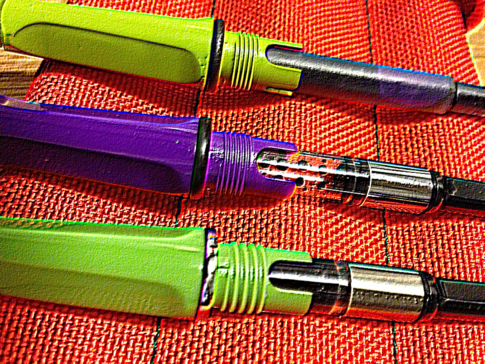
One of two final differences between the three pens is the threading on the nib section. 

As you can see, the threading on the Lamy and Hero is quite tight; on the Jinhao (bottom) it is further apart. I have screwed and unscrewed them a number of times to try and tell the difference but I can't. It just is.


Here it is again with a different photo effect to show it up better:
The final difference is the plastic itself. The Lamy has a more matt finish and ultimately feels higher quality than the other two (which it should given that at around $30 -which is not expensive- it's either double or thirteen times the cost of the other two!). The Jinhao and Hero are more glossy plasic. The Hero also seems a touch more flimsy and rattles a bit when screwing the base on and off. The Jinhao feels more substantial, but is still glossy and lesser quality. For me, this is an important difference regardless of price, as it's one of the things that would see me reach for the Lamy first when considering which of the pens I might want to immediately jot a note with. There is not a lot of value in owning a cheap pen if you don't use it, or if you keep deferring to the original sheep from which it has been cloned.

So, for appearance and design, the Jinhao gets the same as the Hero:
6/10

WEIGHT AND DIMENSION
To begin with, there is little if any discernible variation in the weight and length of these three pens. So that's 13.7cm long (capped) and 12.9cm uncapped; and 1cm wide.

Posted, as I mentioned earlier, the Jinhao and Lamy post deeper and well. Posted they both measure 16.5cm and balance well in the hand. The Hero posted measures 18cm long - too long.

For the Jinhao, a better rating than the Hero in this category
7/10

NIB AND PERFORMANCE

Not sure what the 18Kg stands for. It's not a gold nib, and it doesn't weigh 18KG!

Here is an area where Jinhao is different to the other two pens. The Jinhao 599 sports what I would notionally call a "normal" nib. What I mean by that is clearer here:

The Jinhao is on the far right

Does this make a difference for writing performance? Not really. It, again, comes down to aesthetics. I like the look of the Jinhao nib. Then again, I like the look of the Lamy/Hero too. Nevertheless, I like that the Jinhao nib is a point of difference. On a line for line comparison, the writing sample would suggest that there is really nothing to them though:


None of these pens flex. They each offer simple, comfortable writing.  All wrote perfectly out of the box and have continued to do so. They are comfortable, well balanced (except the Hero when posted), and the colour variations are a lot of fun. For all the (pretensions?) of feed on the rear of the Jinhao, there is no greater or lesser ink flow or flex. It's simply a good 'muckabout' pen; that, for the price, I would be happy to ink with my Noodlers Bay State Blue.


7/10

FILLING SYSTEM
All three pens are cartridge/converters. My preference is piston always, and cheaper pens can do it (Noodlers do). Nevertheless, converters are easy to use too, and so my sleep hasn't been too irreparably damaged.

In my last comparison blog, I showed you one cosmetic difference in the converters:


The Lamy converter has a red handle and black base; the Hero (and the Jinhao) a black handle and metal base. The Jinhao metal base is more of a matt than a chrome look. 

You'll see that the Lamy (bottom) has two different arcs at the base of the section. The smaller one is to capture a separate stud that is on the Lamy converter to help the converter stay put. This extra precaution doesn't appear on either the Hero or the Jinhao; but frankly doesn't seem to make much of a difference.
7/10

COST AND VALUE
For 12 Jinhao's I paid US$2.25 each. That's close enough to the price of one Lamy or two Hero's. The Jinhao writes well out of the box. The colours are fun. The nib looks good; and the pen delivers all that it promises. Is the Lamy 12 times better? No. Is the Hero 6 times better? No. Is the Jinhao therefore value for money? YES...[UPDATE, 2017] however... I have had a number of the lids and clips of my 599s snap off or become loose and fall off; making the pen fairly useless. Is it worth a couple of bucks? Yes, but not for much more than a handy, quick-note taker.
5/10 (down from 8/10)

CONCLUSION
The Jinhao 599 plastic is an excellent copy of an already good value pen in the Safari. While the clip is a negative for me on aesthetics, the Jinhao beats the Hero by being a pen that is as comfortable to write with as the Lamy posted or unposted. Its plastics are a little cheap, issues with the clip and cap breaking or falling off are significant; but it writes well. The colours offered are bright and cheery (although I really like the Hero's purple) and it only costs between the $2.25 I paid and $5 I've seen on some web sites. A bargain.

FINAL RATING: 65/100

Legend:
00-50 =    to be avoided at all costs
51-60 =    If it's cheap and you don't really care...
61-70 =    A nice pen with the makings of something better (just don't spend too much!)
71-80 =    A better than average pen with just a few flaws that stop it from being really good.
81-90 =    A good pen; a keeper. Only a few minor places off being great
91-95 =    Now THIS is a pen! If you can get it, keep it, love it, cherish it, and keep it away from the dog
96-100 =  GRAIL
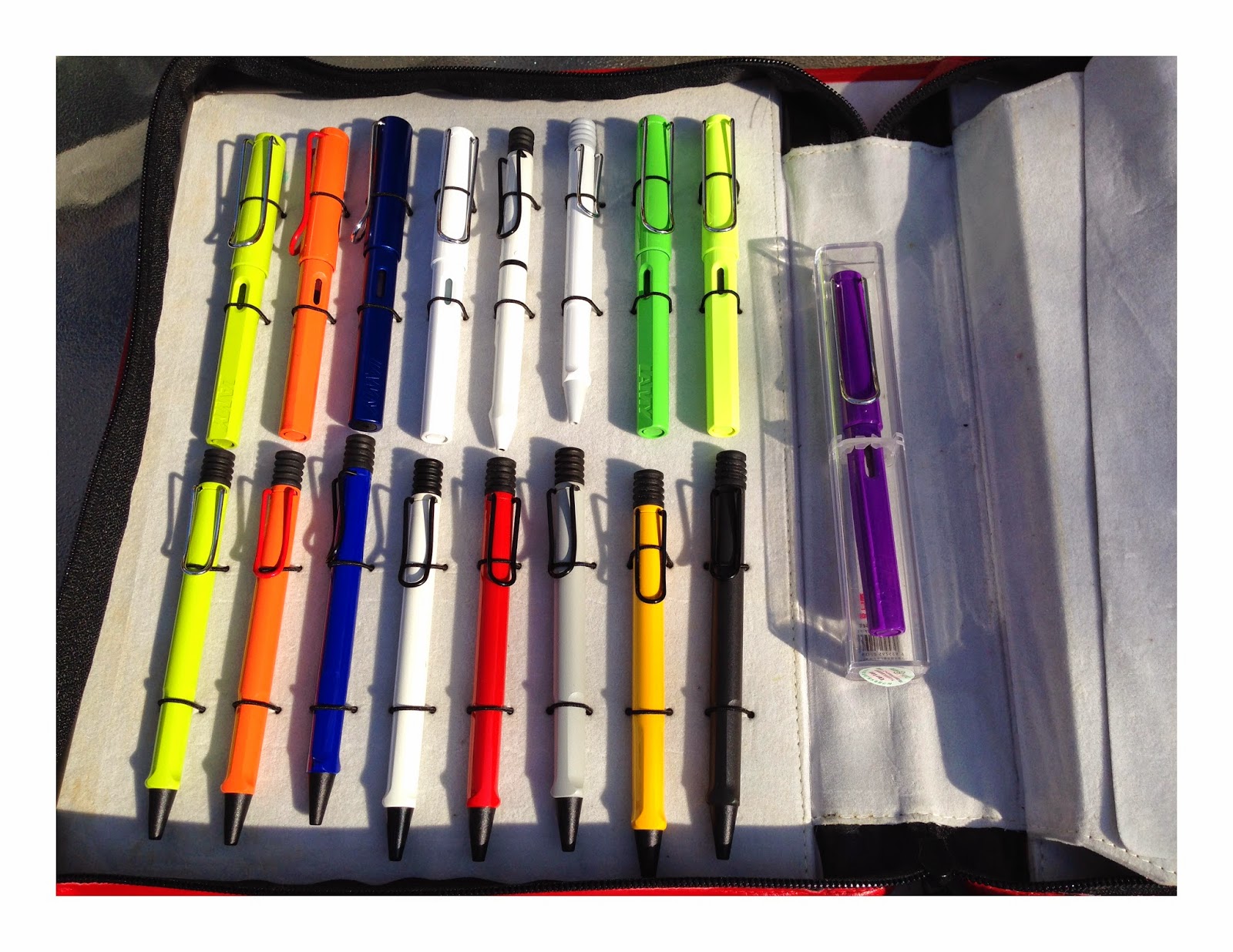
Here's a few Lamy's incase you forgot where we started (the purple on the right, is the Hero)

Wednesday, 16 July 2014

Latest Pen Poem: Don't Think; ink!

It's been some time since my last blog; my sincere apologies. So to get things going again, I thought I'd post my latest Pen Poem; and a teaser for my next review:

DON'T THINK, INK!


 TRANSLATION:
Ink a pen and soon you'll see
Another pen to ink, and glee
Will overtake your common sense;
Your "one" will morph to "many" hence
The trick, when one performs this task,
Is not to think, 
Just Ink,
And fast!

Inks and pens used (from top):
  • Noodlers Habanero; Omas Extra 556 (ogiva gold)
  • Noodlers Saguaro Wine; Pelikan N400
  • Visconti Blue; Edison Collier
  • Diamine Ancient Copper, Radius Superior - Red Arco
  • Caran d'Ache Vibrant Green; Radius Superior -Green Arco
  • Diamine Sapphire Blue; Radius Comet- Brown Arco
  • Unknown cartridge turquoise; Kaweco AL Raw
  • Another unknown Pelikan cartridge; Pelikan Twist

Finally, here is the teaser for the next blog:

Do you know what it is? Hint: I paid $US2.25 per pen...

Until next tine,

EB

Monday, 2 June 2014

WINNER OF THE ECCLECTITBITS INK COMPETITON!

Thankyou to those who got their creative juices flowing and rhymed their way into my competition!

Because I'm a small blog, I get to choose by my own choice, not a random number selection so the winner (no correspondence will be entered into) is the entry that I most liked.

And the winner is.....

"Ebonite or celluloid that is the question
Such is a choice that could lead to indigestion

Love the camphor smell and slightly greasy feel
But adore the warmth in hand that truly is ideal

Celluloid can burn which is a proper scare
Ebonite can fade in the sun so beware

So both I guess - one of each I'll charge it on my card
Give me the damn ink cause poetry is hard."

Gerald Taylor - thankyou for your great effort!  You get to choose which one of the inks you would like.

BUT WAIT THERE'S MORE!

After Gerald makes his choice, there is a second prize and second winner; and that winner is.....

"Celluloid or Ebonite? Oh what a choice...
The colors of celluloid give my pen voice...
But ebonite, oh, it's a lovely material...
Ah, my pick is celluloid, of a shade ethereal."

Thankyou Jen B. Excellent effort!

For the winners, please send me your mailing details to:

ecclectitbits@gmail.com

and your prizes will be in the mail!

Until next tine:


Saturday, 17 May 2014

REVIEW: Marlen ALEPH

The Marlen Aleph (the first letter of the Hebrew alphabet) is the result of a collaboration between the Italian pen manufacturer Marlen, and Daniel Greco, the moderator of the fountain pen forum Fountainpen.it.

The result of this collaboration is a Flat Top piston filler with and a nib made from what the advertising blurb describes as "fine harmonic steel" (although I couldn't detect any noise coming from the nib). It's promise suggests modern flex and great writing.


I already have a Limited edition from Fountainpen.it, a Delta Fusion, which was spectacular. So my hopes for this pen were high.


FIRST IMPRESSIONS
Impressive packaging; now let's see inside. Ah-ha. Hmmm.... Interesting. 


Colour a bit dull. Wow, that nib looks different! I wonder how it writes.....

7/10


APPEARANCE AND DESIGN
I was disappointed with the colour. It's a black base with a shimmering acrylic lighter blue (the description gives it more credit than it deserves). Not offensive; just not very exciting.

It's bigger than I expected (longer). The design is simple, a flat top pen with allusions to an earlier time. The blind cap is nicely aligned.


I definitely like the look of the nib (but more on that below).

Mine is #17, but I'm not sure how many of these were made; and I believe they are to be produced in bulk soon enough.

It certainly looks well made. The clip is solid. The side is etched with "Marlen, Italy. Fountainpen.it. Aleph"; and the top of the cap has the Marlen logo in silver and black.

Ideally, the capping and uncapping should really be an action that is so quick you hardly notice it. Unfortunately,

I really noticed it with the Aleph. The number of turns needed to uncap the Aleph is around 5 - too many! And it seems to be around 6 to put the cap back on securely. While not a massive issue, each time I did it, I continued to get annoyed.


6/10

WEIGHT AND DIMENSION
My weight reviews are based entirely on feel (I don't bother with a scale - it's a fountain pen not a bowling ball!). But I can tell you the Aleph feels well-balanced, in the hand posted or unposted.

Capped, my pen measures 14.2cm long and around 1.3cm wide in the body (marginally wider in the cap). Uncapped, I measure 13.3cm from nib tip to base.


Posted the pen measures 17.2cm in length (bloody long!) but comfortable to write with either way.

7/10

NIB AND PERFORMANCE


The nib is a looker! It is a large nib, I love the 'Aleph' symbol etched onto it's steel centre. I love the curves of its taper and volin-like curves to its girth (this may add to its claim of "harmonic" steel). The nib creates anticipation of its performance.

The Aleph's steel nib is a little reminiscent of the Pilot FA, (and therefore promises much). The feed is plastic (hmmm) and transparent (interesting). So when you fill this nib, the feed takes on the hue of your ink. As my first ink was the Marlen brown that came with the pen, guess what? After a clean, it's pretty clear again, but there remains a little browny hue so I'm guessing over time the transparency of the feed may be less revealing.

nib is full here. Note brown hue to feed.
The air-hole in the nib is interesting; as it is quite large and seems to reveal the colour of the ink (novel).
Herbin Violette Pensee inside.
Writing? Certainly smooth out of the box. There is a little flex; but not anything extraordinary.
There is nothing like the flex of a Falcon or even a Noodler's Flex pen. This is very disappointing given the promise of the nib. It doesn't provide much feedback either (another disappointment for me, as I like to feel the nib performing). This pen would be great for someone who is used to a ballpoint and is thinking of getting into fountain pens. It's predictable, but you can coax some line variation out of it. Indeed, if you read the blurb that came with it (after translating it from Italian - which I've done below), that is perhaps what the Aleph is attempting to do. Therefore, not really a fountainpen writer's pen, but a great beginning in a shift from ballpoints.

6/10


FILLING SYSTEMPiston. Works well, holds a reasonable ink supply. I am not a major fan of having a blind cap that covers the piston; for me, that just means more bits to lose. Nevertheless, the piston works well; and there are always extra points for a piston filler.

8/10

COST AND VALUE
At time of purchase, this pen was around US$140. For the price, the Aleph is a reasonable value pen.

7/10

CONCLUSION
The Marlen Aleph was a bit of a disappointment. My last Fountainpen.it pen was so wonderful I anticipated something a lot better than I received. It is not a bad pen. It's just a touch dull.


Maybe the Bet will be Bet - ter!


68/100


0-50 = to be avoided at all costs
51-60 = if it’s cheap and you don’t really care….
61-70 = a nice pen with the makings of something better (just don’t spend too much)
71-80 = A better than average pen with just a few flaws that stop it from being really good
81-90 = A good pen, a keeper only a few minor places off being great
91-95 = Now THIS is a pen! If you can get it: keep it, love it, cherish it, and keep it away from the dog
96-100 = Grail


Tuesday, 6 May 2014

New Pens arrive: Fountainpen.it Marlen Aleph and Montblanc 90th in Rose Gold (146)


What a day this has been
What a rare mood I'm in
Well it's almost like being in love....

There's a smile on my face
and a Marlen in Place
and a Rose Montblanc now I'm in love
(apologies to Lerner and Lowe)


Yes,  my wonderful post locker has revealed two lovely pens in as many days. The Marlen Aleph (produced for Fountainpen.it); and the Montblanc 146 90th anniversary in rose gold; and I'm a happy little vegemite!

Both very different pens; both have come with ink: the Marlen has a Marlen brown (bottle is unmarked, but it comes out very similar to Diamine Ancient Copper - that's good!); and the Montblanc has a special 90th anniversary permanent grey (haven't tried this yet).

I have only played a little so far, so no reviews; but here are a few pics to start the music playing:

So here is the Aleph. It's a large pen (just under 149 size), a piston filler beneath a blind cap. Mine is Number 17 (not sure how many were made for subscribers; but Marlen may make it more commercially soon to follow). It came in blue/black resin.

This is a different nib. Steel with cut out designs (very falcon-esque?).
 And now the Montblanc:
Montblanc standard boxes usually aren't much, but I like this sleeve design for the 90th anniversary rose gold; and the 90th anniversary ink and pen pouch all from Appelboom - thankyou.

And finally the pen and nib:


Ain't she a beaut?


Monday, 5 May 2014

Competition: Win INK!

I have two bottles of ink - one I have filled one pen with, the other only dipped. Both have their fans; but neither does it for me. So, if you want a bottle of Iroshizuku Kosumosu (one pen filled) or a bottle of Noodler's St. Patty's Eire (a green highlight ink - only dipped),  answer the following question and my favourite answer will win the ink of your choice. Both inks will be prizes.

Here is your question (which must be answered in rhyme):

Celluloid or Ebonite?

Post your answers in the comments section on this blog; all answers will be published unless they breach internet protocols or reasonable politeness.

Competition closes 31 May.

Yours in the fullness of tine,

ECCLECTITBITS

Saturday, 3 May 2014

Review: Stipula Etruria facetted OS Celluloid LE

This review comes one and half years AFTER I received this pen. I know, I'm a little slow. Nevertheless, 18 months later this pen remains one of my favourites and therefore definitely in line for a proper review.

FIRST IMPRESSIONS
It's BIG. It's beautiful, it's different. Chatterley Pens has done it again!
 9/10

APPEARANCE AND DESIGN
It's BIG. It's beautiful, it's different!
A limited edition pen, (mine is #12 of 18) that was produced in collaboration between Stipula and Chatterley Pens, this pen delivers the level of individuality and quality you don't always see in so-called limited edition fountain pens.

The green shimmering flecks on the black celluloid base are just wonderful.

Always a fan of facetted pens (no rolling on the desk), the 8 facets on body and lid help the light to create all sort of fun as it refracts on each angle.

The piston Knob is invisible (well, relatively) at the base of the body which allows for the seamlessness of the colour.
But the most unique aspect of this pen lies in the screw-on cap. For a start, the threads for the cap are at the base of the nib rather than at half way down or at the base of the section. This works well, and helps the sustain the fluidity of the design. The next unique feature is the rings ... all 6 of them! Six sterling silver rings wrap around the base of the facetted cap in counterpoint to the silver, Stipula, clip. While there is potential here for garishness or overkill, this really works well - just beautiful.

9/10


WEIGHT AND DIMENSION
This is a big and heavy pen. Both things that I love. If you don't like heavy pens or long pens, l suggest you leave this one alone.
I don't have scales for this, but just trust me, it's a well-balanced, but weighty pen.
Capped, the pen is 15cm long and around 1.5cm wide in the body (marginally wider in the cap). Uncapped, I measure 13cm from nib tip to base.
While the pen can be used posted (and I am generally a poster).
Posted the pen measures 17cm in length (bloody long!) and although not hugely unbalanced, not as comfortable as unposted.


9/10

NIB AND PERFORMANCE
The nib is a good size, 14k Stipula; which, in itself, is a good beginning. When you add to this that this nib was tuned (prior to my receiving it) to Cursive Italic by Mike Matsuyama, then really, nothing more need be said. This nib is a joy and a delight to write with. Smooth, fabulous line variation, that starts first time every time (and has done so for 1 and a half years).

10/10


FILLING SYSTEM
Piston. Works well, holds a good ink supply (which you would expect for a pen this size). My only criticism is that the piston knob is a tiny bit loose (ie. it can move a tiny fraction before it engages) which means that sometimes the facets do not exactly align.

9/10

COST AND VALUE
At time of purchase, this pen was around US$500. So it's not a cheap pen. But on value for money, the fact that I am singing it's praises one and a half years later, suggests that this pen well and truly stands up to the competition. A marvellous pen.

9/10

CONCLUSION
The Stipula Etruria - facetted, oversize, celluloid limited edition fountain pen (whew! what a mouthful) is a fabulous pen!!

92/100
 Click here for original FPGeeks report: fpgeeks.com/2012/10/stipula-and-chatterly-pens-introduce-the-faceted-etruria-oversize-fountain-pen/


0-50 = to be avoided at all costs
51-60 = if it’s cheap and you don’t really care….
61-70 = a nice pen with the makings of something better (just don’t spend too much)
71-80 = A better than average pen with just a few flaws that stop it from being really good
81-90 = A good pen, a keeper only a few minor places off being great
91-95 = Now THIS is a pen! If you can get it: keep it, love it, cherish it, and keep it away from the dog
96-100 = Grail