Monday, 31 August 2020

SEND IN THE CLONES! The Moonman F9 makes a landing on Mount White.

In September 2017 on this Blog, I said I had been Peking into a few of the recent Chinese fountain pen offerings and suggested I was finding Mao and Mao to like! 

Enter 2020 and the Chinese are really showing that they're not "cloning" about, with the release of the Moonman F9.

OK; enough puns I hear you say, so let's go straight to a quick overview of the Moonman F9 that arrived in my post box today. This is not one of my full reviews, as the pen is just new, but just a few short observations and a little musing.

Back in 2016, Montblanc introduced a new pen in commemoration of 110 years since the release of the original Montblanc Rouge et Noir in 1906. The pen was a departure from the usual Montblanc offering; and had a few tongues dangling with excitment. (My Blog review of the pen is here: Rouge et Noir review  ). 

In more recent times, Montblanc released a variation on the "new" Rouge et Noir which they called the Spider Metamorphosis. The new version was the same pen but swapped the Snake for a spider garnish on the cap, clip and nib.

These were lovely looking pens (if you're into snakes and spiders at least). The Snake gave Montblanc lovers a chance to drink again the Agatha Christie Writers Edition - Light.  It had the curly snake clip with, in the coral edition, gems in the eyes of the snake and a two tone nib featuring a snake's head. The black version had a single tone rhodium coated nib. It was a weighty pen (inspite of its narrow girth) and became an instant classic. The Spider version (the web edition?) had an almost deco design to the spider clip; and was similarly well received. The pen was also, for Montblanc, relatively affordable (around US$650) on release, and is available on-line currently for prices varying from $665 to $1168 on my best searches.

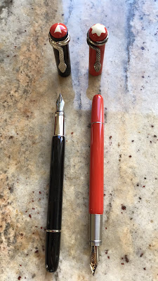
Now enter Moonman, a Chinese brand that has been gaining recognition more and more of late. Let's not mince words, the F9 is a very clear clone of the 2016 Montblanc Rouge et Noir; and it can be obtained in the black or coral and with the snake or spider design. But at US$23.90 (including postage and before local taxes) it's clearly not like-for-like and my expectations are low. 

I chose the black, as I already have an original in coral, forked out my money and waited to see what happened.

When the F9 arrived I was surprised. 

Firstly it was quick (in a Covid-19, lock-down climate that is no mean feat!)

Secondly, the packaging eclipsed Montblanc's original packaging by a long way: black slip-on sleeve over a wooden box subtly branded Moonman, inside of which a clever slip of paper reveals cap and snake only before being removed to reveal the whole pen snuggly nuzzled in its niche. Impressive.


To the pen. Well it looks like it's meant to. Good start. Surprisingly, it doesn't feel as "cheap" as I expected. Indeed, it doesn't feel cheap at all. There is a good weight to the pen; not as weighty as the original, but not much lighter. The Finial doesn't boast the custard pudding of the original (then it really would be a copy wouldn't it?) but a stylised exclamation mark (or at least that's what it looks like to me).

Exclamation mark inverted here!                                     

It's a piston filler (or at least I can't see if it's a captured converter - which I heavily suspect). And once I ink it, it drawers in the ink well and writes extremely adequately. 

There are a few subltle differences from the original:

  • It's longer: 14cm capped (the orignal is 13.5cm); uncapped 12.8cm (about the same as the original)
  • The piston ring is mildly broader
  • the section is a glossier metal finish (may be a touch more slippery than the original?)
  • The snake head is a bit larger than the original
  • The custard pudding top has a touch less self-raising flour - and didn't rise quite as much as the original.

but for all intents and purposes, this is essentially the same pen.

So here comes the philosophical quandry (and the issue leading to lots of angst amongst my IG brethren): 

Should the pen community support the production and selling of a pen that is clearly a copy of another?

Yes.

As good a copy as the F9 is of the Montblanc Rouge et Noir, it is not the Montblanc Rouge et Noir; and it doesn't claim to be. The materials, the branding and the price are all clear indicators of differences. I own cheap copies of expensive watches and I enjoy them. I know they are not IWC or Rolex; but they work, they emulate a great design, I can afford them, and I'm happy. This is all the F9 is: a fountain pen that takes it cues (heavily) from Montblanc; but isn't. 

Now let the debate continue (while I write it down with my F9)


Sunday, 2 August 2020

Good King Leonardo - erupts with a winner!

GOOD KING LEONARDO ISN'T JUST LION AROUND!

Leonardo are the fountain pen manufacturing Phoenix that has emerged from the ashes of OMAS and Delta to produce extraordinary quality fountain pens that just keep getting better and better. 

How fitting then, that Leonardo should offer two new fountain pens based on the Italian Volcanos Stromboli and Vesuvius!
Stromboli erupts!

FIRST IMPRESSIONS
A limited production to begin with, the Leonardo Momento Zero Grande Stromboli has made its way to me thanks to Novelli Pens (no affiliation), and, echoing the sentiments of all who have seen this pen, I provide this warning: 

Opening the box may seriously lead the new owner to suffer inexhaustible paroxysms of joy!


 10/10

APPEARANCE AND DESIGN


While there are some other interesting tweaks to this pen that separate it out from other Leonardo Momento Zero offerings, the explosive core of this pen IS its appearance.

Thanks to the genius of Jonathan Brooks of Carolina Pen Company the material on this pen (that he calls "Primary Manipulation") makes it both unique and superb.

No two pens are alike - giving you a sense of both artisan-made and exclusivity. And if you like colour... welcome to a cornucopia of shade, hues, tints, tinges, swirls, dabs, splatters and heaven!

The two offerings provide either a more greenish theme (the Stromboli: which I have) and a more red theme (the Vesuvio: seen below in a photo from the Novelli website):


I can't get enough of the variations and colours in my Stromboli. The cap has a more greenish theme, the section swirls with white, and the body runs with evocative clouds of lavender blues and pastels. While together this may seem to suggest a mish-mash of colours in sections that tear apart the uniformity of the design; this is not the case - all together this just works!

The white rhodium trim and nib work in beautifully with the resin, breaking it just enough to add interest.

Only one warning: if you order this pen because you want a particular pattern or colour combination, then this may not be the pen for you. You get what you get. Each pen, as I have said, is unique, and the colours land where they may. To me, this is another aspect that makes this pen highly desirable.


10/10

WEIGHT AND DIMENSIONS 
The Stromboli is not a heavy pen (35.3g); which is particularly pleasing because this is the larger of the Momento Zeros, the "Grande", and it's also a genuine piston filler which can often add weight to the equation. No. This pen has a comfortable weight that sits easily in the hand and can write away forever without feeling tiring.


Length wise, the Stromboli measures 15cm closed, 17cm posted and 13.5cm unposted. A good size.

At this size, the Stromboli is a comfortable write either posted or unposted, and doesn't seem too unbalanced when posted; although I should add that I hold my pen quite far back and if you tend to be a nib nurturer (ie. you hold your pen very close to the nib) then it may feel better unposted.
9/10

NIB AND PERFORMANCE
This is the first of my Leonardo pens to have an Elastic nib. The elastic nib is a 14k gold nib (rhodium plated) that has a number of cut-outs and longer length to assist it to provide a semi-flexible result. The nib also has an ebonite feed (always my favourite as I find the ebonite helps to make a better -wetter - writer which is my preference).


For the first fill I chose Caran d'Ache Amazon. Amazon is a drier ink and as such the flow was bit quite where I would like it. For the second fill I used Pilot Iroshizuku Kon-Peki and the flow was perfect. Using a variety of papers, the nib worked well; and best on tomoe river. This is not a full flex nib; and I am yet to find a modern flex that even approaches the glory of vintage flex; but the Leonardo Elastic nib has a nice bounce to it and produces a little variation without too much pushing.
8/10

FILLING SYSTEM
Piston fillers are always my preference, and this is the first time Leonardo have introduced their own piston filler. 


Photo of my pen sent by Novelli

My experience with Leonardo filling systems is that they enjoy being a little innovative and experimental and I like that. Apparently this one holds 1.5ml which is a handy amount. The piston reminds me a little of the Montegrappa ratchet piston which has a little tactile ratchet feel and sound to it; but actually I prefer the Leonardo which seems to feel a little more solid to me than the Montegrappa.
10/10

COST AND VALUE
Only 100 of the Stromboli and Vesuvio were produced (50 of each) - all of which have (naturally) sold out. I believe a new batch are scheduled from November this year.

With a limited batch, a unique resin and a smaller, high quality manufacturer you can expect a higher price tag. (I must say that this is one area when the weaker Australian dollar, taxes and high cost postage can be nasty). 

Nevertheless, the Leonardo Momento Zero Grande Stromboli and Vesuvio are priced extraordinarily fairly; and the satisfaction/euphoria that comes with the end product is not to be denied.
9/10

CONCLUSION
The Stromboii is an eruption of bliss. Leonardo are proving themselves to be the new Royalty of Italian pen manufacturers; offering quality, innovation, creativity and flair!
93/100


00-50   = to be avoided at all costs
51-60   = if it’s cheap and you don’t really care….
61-70   = a nice pen with the makings of something better (just                 don’t spend too much)
71-80   = A better than average pen with just a few flaws that                     stop it from being really good
81-90   = A good pen, a keeper only a few minor places off                       being great
91-95   = Now THIS is a pen! If you can get it: keep it, love it,                     cherish it, and keep it away from the dog
96-100 = Grail


Sunday, 1 March 2020

WINNER OF PILOT 91 CH ANNOUNCED!

Congratulations to @peppercornarts for winning the Pilot 91 Custom Heritage giveaway - courtesy of bookbindersdesign.com.au

Please contact me to give me your contact details and the pen will be on its way!!

Thank you everyone for your comments and interest.

Until next tine...

Saturday, 8 February 2020

The Pilot light is on, but... (a controversial view - and a giveaway)

I have a complex relationship with Pilot.

  • I love Vanishing Points (or "Capless" if you're in Australia - so less imaginative a name!);
  • I love Decimos (marginally smaller Vanishing Points - with another lack-lustre name - but great pens);
  • I like Falcon nibs;
  • I love the gentle cushioned "thwack" of the cap when you replace it on a Prera;
  • I like Kakunos and the cheeky smily faces on the nibs.
  • I love the ingenuity of Pilot Parallels;
  • I love the quality of Pilot nibs - never had a Pilot nib that didn't work well straight out of the box.

There is no question: the Pilot light is on; but...

there is just no spark!

Ok, I'm just going to come out with it: Pilot Pens (other than Vanishing Points, Decimos and Kakunos) are dull; and yes, this includes the iconic 823.

There is nothing wrong with their quality, their ingenuity or even their creativity; but when it comes to design, (again with the notable exception of the VPs and Decimos) to me they lean towards "functional" over imaginative: the pen that takes you from A to B, no issues; then you park it, lock it, and forget about it.

THE CUSTOM HERITAGE 91
FIRST IMPRESSIONS
There is nothing wrong with the Pilot Custom Heritage 91.

Box: utilitarian (but that's fine).

Pen: yeah, it IS one. It looks like one, colour is nice. But gee, its ... O.K.
7/10

APPEARANCE AND DESIGN
I've mentioned this before but let me say again that: “In matters of grave importance, style, not sincerity, is the vital thing”. Oscar Wild - The Importance of Being Earnest.

The Pilot Custom Heritage 91 is sincere.
I'm pleased that the clip isn't the ball-clip present in many other Pilot pens - ball-clips always remind me of the budget Sheaffer 'No-nonsense' pens - cheap but functional, 1970s clunky -. This clip is better, a touch more class (just a touch); but I'm not too sure about the "Pilot" engraving on the clip: simple, uppercase lettering on the top of the clip that again seems to cheapen the pen and make it look a little like the sort of throw-away pen you buy from a milk-bar or paper shop. 

The Orange, as I've said, is a good colour - and quite bright for Pilot main-stream. The black section and finials (top and bottom) go well with the orange; and the silver hardware tops it off nicely. 
The silver cap-band is probably my favourite feature from a style perspective - and I'm not really sure why. Perhaps it is that the band offers a touch of class, or variation to the pen that helps it to look a little less pedestrian, safe, and middle of the road.
7/10

WEIGHT AND DIMENSIONS 
It's a light pen.

Not too light, not too heavy. A good, practical weight for writing. Functional.

The 91 is a mid-size fountain pen (comparable in size to a Sailor ProGear Slim) at a length (capped) of around 136mm; uncapped around 123mm). 

It can post comfortably, and due to the lightness of the pen this doesn't upset the balance at all. 

While I tend to prefer my pens girthier and heavier; the Custom Heritage 91 delivers on what it promises here.
8/10

NIB AND PERFORMANCE
Pilot knows how to produce good nibs; and this, 14k gold nib is no exception. I managed to snag a soft medium (normally only available for the black model of this pen for some reason beyond me); and it is a dream!
Again for reasons that I do not understand, Pilot tends to make nibs like the Soft Medium (SM) unavailable outside of Japan. 

I have used a Pilot SM nib before: at the Pilot stand at the 2018 Sydney Pen Show. When I last used it I remarked what a fabulous nib it was. Using the SM nib in this pen I was again aghast at why this nib isn't more freely available. It's supurb.

The nib wrote beautifully out of the box. A little wet (the way I like it), a lovely bounce, perfectly smooth, with a dash of line variation. 
Ignore the B sticker, it's a SM.
If I leave the pen alone for a while and pick it up to write again - no issues. It writes beautifully first time, every time.

The nib is a size 5 - just one size too small for my preference - but utilitarian. 

As for the feed. It's plastic (as are most feeds in this range), and it works well; but for some reason, this one was a greyish colour which, for me, made it look VERY plastic and did no favour to the aesthetic of the pen or nib. The only reason I didn't score the nib higher was its size and the look of the feed; otherwise, best feature of the pen.
8/10

FILLING SYSTEM
Piston fillers are always my preference. This pen is a cartridge/ converter pen. Nothing wrong with it. Easy to clean. No issue changing inks. Utilitarian.
7.5/10

COST AND VALUE
The Custom Heritage 91 is meant to be part of Pilot's mid-range. Being mid-range however, does not make this a cheap pen. At Bookbinders Design it retails for around AU$216. Expectations at this price are greater than say for a Pilot Kakuno, Prera or Metropolitan. For AU$200 plus, this pen has to kick a few goals; and it's good - just not interesting. With so many other choices out there, it really has to appeal to you to pay this sort of money.
6/10

CONCLUSION
This blog is a personal opinion; and I know my aesthetics are not everybody's (luckily). There is nothing intrinsically wrong with the Pilot Custom Heritage 91; and there is a lot that is good about it (especially the nib).

It is utilitarian. It writes well. If that is what you are looking for in a pen, then look no further.
Here it is compared with a Blue version of the same pen.
For me however, I'm (clearly) looking for a little more.

A similar size and colour Sailor just provides the spark for me that the 91 just doesn't. I know it'll work; but I want more.

I would be interested to hear your thoughts (politely of course); especially if the Pilot Custom Heritage 91 is your sort of pen. 

AND, if you REALLY like this pen, thanks to Bookbinders Design, it could be yours!

Just write a comment on this Blog story or on my instagram post for this pen by no later than Friday 14 February, (Valentines Day), and I will select a random winner of this pen. Giveaway open to international.

Overall Score: 72.5/100


0-50          = to be avoided at all costs
51-60        = if it’s cheap and you don’t really care….
61-70        = a nice pen with the makings of something better                          (just don’t spend too much)
71-80        = A better than average pen with just a few flaws                            that stop it from being really good
81-90        = A good pen, a keeper only a few minor places off                        being great
96-100      = Grail