I do however, like USING inks; lots of them (although I maintain I'm not a collector, just an accumulator).
For me, it's the colours, the shading and the sheen (OK, and occasionally the glitter) that draws me to an ink (pun intended). It is these factors that have lead Robert Oster Signature inks into my fountain pens and up to the top of my list of preferred ink manufacturers.

The label on at least one of my Robert Oster inks reads:

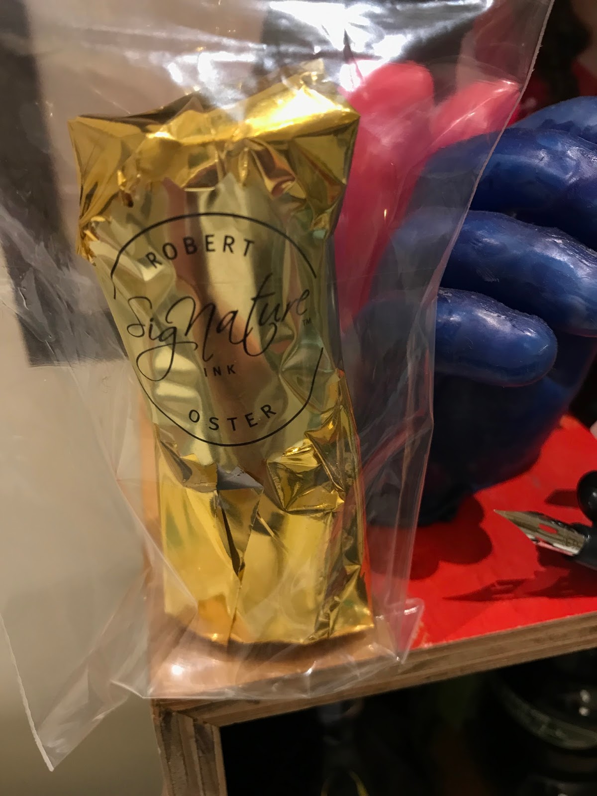
It seems not so long ago, Robert Oster was chatting to a group of us on the Fountain Pens Australia (FPA) Facebook page about a few inks he had created. At that time I bought my first (and still favourite) Oster ink - Bondi Blue, and a few others (Australian Sky and Turquoise) that he sent in his fabulous gold foil, glitter paper together with a bonus Jinhao fountain pen.
I said before that I was not an ink collector; and just to prove a point I have only 14 examples of this cornucopia of colour (although I DO wonder, just how many shades of blue do you really need?). Do I want more? Of course! But what is it that makes these inks so special? Well for me there are four things:
1. The variety. 81 plus colours. If you can't find a colour you love here, you just don't like colour!
2. Sheening. I just love sheening! What is sheening? It's the appearance of a second colour in areas where the ink pools up. Here is an example:

Not every Oster Ink sheens; but the ones that do are legendary! Bondi Blue, Fire and Ice, Peppermint, River of Fire are all examples of inks that ooze personality and surprise.
3. Robert Oster. Robert is not faceless manufacturer. He is an active member of the fountain pen community.
Robert was contributing to conversations from almost the beginning of FPA. He provided free ink samples to the Melbourne Pen Show, he creates inks in response to questions and suggestions from individual users (the NG Special '16 and the FPA Kada Kada colours are great examples of this); and he remains active on major social media platforms and fountain pen hangouts (instagram, Facebook, etc) where he shows his inks, thanks people for their comments (whether positive or negative) and shares his views.
4. It's Australian! Yes I know, but it's difficult not to feel a touch of national pride when you live in a relatively small nation and one of your own starts to make a positive impact on a global stage (he's the Hugh Jackman of the Pen world!!)
 |
| Note the gold glitter from the packaging! |
Robert recently sent me a new ink of his: lipstick red, and, while it has a lipstick look, I have very little use for a red ink, and this one didn't really float my boat. But that is the joy of choice. In Oster inks there is truly something for everybody!
 |
| Lipstick Red |
Which leads me finally to a brief showcase of my current favourites (understanding that there will be more; always more):
 |
| From top, left to right: Emerald (who needs MB Irsh Green?), Bondi Blue, Fire and Ice, Turquoise (more like a teal), Khaki, Australian sky, Peach and NG Special '16 (an alternate to Noodlers Apache Sunset?) These samples were on Color-ring paper. I have found that this paper is true to colour; but not so effective at demonstrating sheen. See the next pic for a better idea of sheen in Bondi Blue.  |
NB. I have never met and do not know, or have any business dealings with Robert Oster. This is just the ramblings of an honestly ensnared admirer of his work.
No comments:
Post a Comment